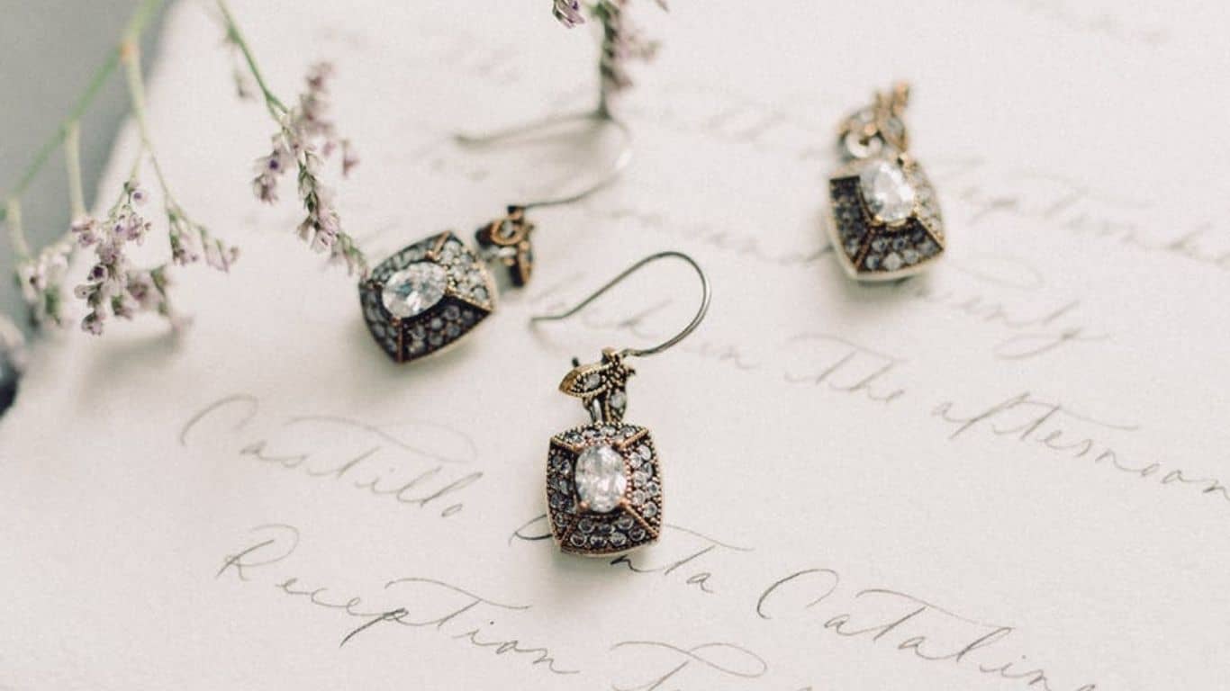
Aren’t we highly confident wearing a bracelet or a ring with a rare stone, or a diamond necklace? I can hear the voice in your head, ‘Yes’. Well, that’s the reason the Jewelry market is growing fast and is estimated to be worth $292 Billions by 2025. Most of us use jewelry products as a form of personal expression. Wearing diamond and gold is considered a luxury. But what makes a premium jewelry piece special is not just the material, but also the craftsmanship of the jewelry designer, and the sheer amount of attention they pay to the design detailing. The same design detailing efforts go into Jewelry website design and development too.
Jewelry businesses are all about luxury, fashion, and experience. But can it survive without a robust supply chain? Nope. Similarly, an ecommerce jewelry website may not be able to drive good results if the website design is flawed, if it scores low on usability, and if it’s built in a way that the tech stack is not scalable, or if it is vulnerable to hackers.
According to the statistics, 48% of users do consider design responsiveness as a crucial factor behind how they perceive the target company, and 38% of buyers or visitors may stop exploring a website if it takes too long for the images to load.
This is the reason that 73% of the companies are revamping their website designs. For Jewelry companies, especially for the ones with ecommerce arm, the website aesthetics is highly important. And so, we recommend the design thinking approach for designing jewelry websites and mobile applications.
Top Tips for Designing a Jewelry Website Experience
When the stock market was highly Volatile, Crypto was unpredictable, and global trade was highly sensitive to Covid news in 2020, Investors around the world turned to the evergreen commodity -GOLD. That’s something unique about Gold, investors have huge confidence in it. In the web/mobile application development world, the Design Thinking Process is akin GOLD. It’s worth investing in, and is risk free. In fact, Codewave’s unique apporach to design thinking has won us many recognitions including a feature of one of our app designs on DesignRush in their blog on best app designs. And here are our golden tips to design a highly effective (intuitive) jewelry website:
No Bull$#!% Checkout Pages
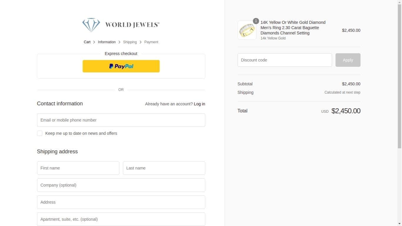
Source: WorldJewels
The biggest reason behind cart abandonments are complicated checkout pages. So, let’s start with addressing this loophole before we fix others.
Never-ending checkout processes may irritate the visitor; even studies say that 26% of online users abandon carts due to extended and complicated checkout processes. In this 4G world, where long processes are finished in a few moments at your fingertips, the user will not tolerate a lengthy checkout procedure.
If you want to design your jewelry website checkout page in a user-centric way then delete all the unnecessary information from your checkout page and only keep actionable useful details. In fact, this tip applies for the entire website, delete the fluff. Your jewelry buyer does not need to know** the brand you like, and if you are vegan. Quick checklist for your checkout page:
- Provide Guest Checkout Functionality
- Use Social Login Options
- Show A Progress Bar
- Provide Them Multiple Payment Options
- Use Security Badges On Payment Page
- Allow Cart Modifications
- Minimize The Number Of Steps To Checkout
Jewelry Visualization
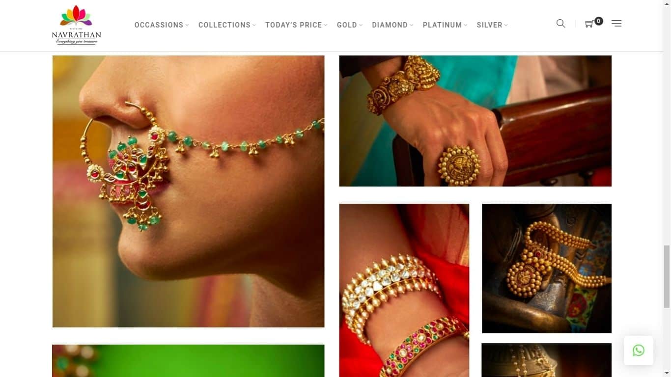
Source: Navrathan Jewellers
Human brain is more captivated by images than information in text format. 90% of the buyers are more influenced by the product images than the product info.
Therefore, jewelry product images are highly impactful in conversion rates. Pictures can reveal everything about the product that the user wants to see before purchasing. And so, most of the trendy and popular jewelry websites prioritize the product’s picture quality.
The images on your jewelry website are also a reflection of your business, and your professionalism. Plus, it can better connect the users with the text content. So, if you are looking forward to creating an effective design for your jewelry website with lux experience, then first focus on the product’s picture quality, and how it’s presented. Color themes across the website also plays a crucial role for a jewelry website. Presently, Royal blue and Grey color is attracting more traffic in comparison to other colors.
Here are quick tips to win the visual game:
- Use multiple images of your jewelry – Feature, scale, lifestyle, and studio shots
- Use optimized high-quality images for better website speed, SEO performance
- Lazy-load your images for web speed and user experience
- Use colors that blend well with your brand for consistent user experience
- Host your images in the cloud (S3) for high performance and to cut digital infrastructure costs
Copy, Convert.
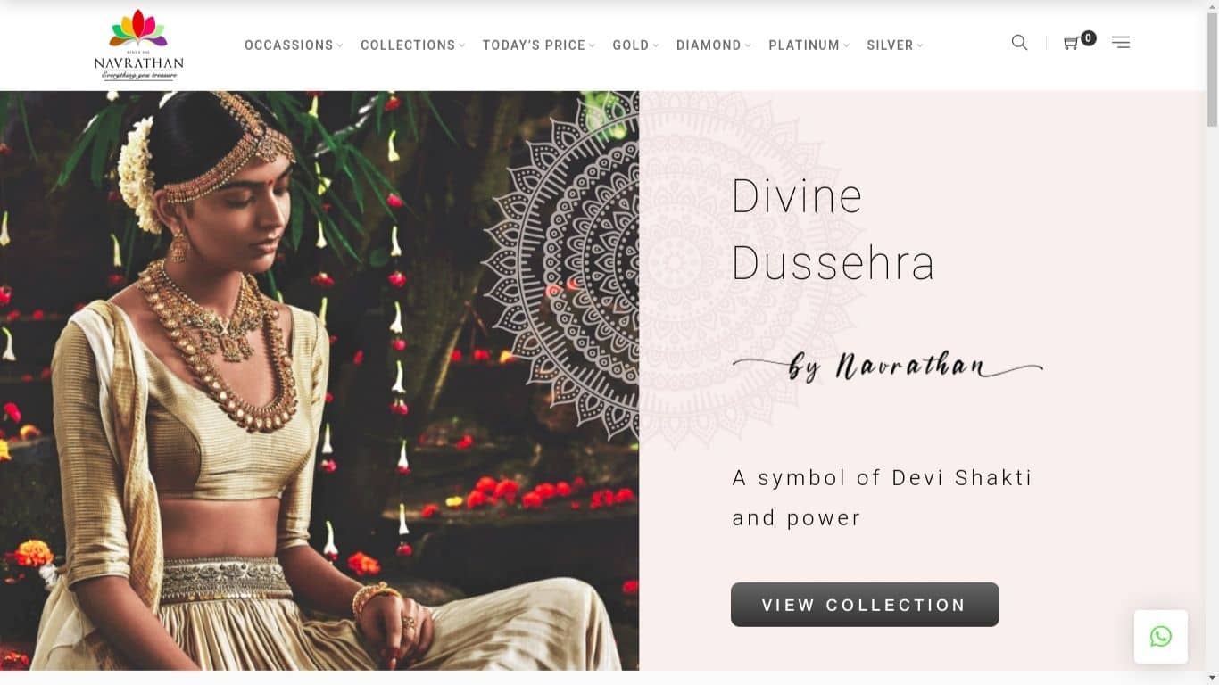
Source: Navrathan Jewellers
The copy that you put up on your website is highly critical for the success of your e-commerce application. As a Jewelry website owner, you must include chat assistants on the jewelry ecommerce website and app, but still the #1 equivalent of an in-store shopping assistant is not your chat assistant, instead it’s the COPY on your website.
Your jewelry website design should augment the impact of your jewelry website copy, and vice-versa. Why? More than 50% of users focus on the keywords rather than the entire content. So, ensure that your Copy is highly convertible and visible to the buyers.
On top of the design-copy harmonisation, you must also focus on the SEO aspects. Because your competitors are equally accessible on the web, buyers do compare their products and offerings with that of yours. They use either product comparison websites or they search it manually using the search engines. So, your website needs to be equally discoverable.
For example, if someone wants to buy an engagement ring, then they will search keywords like “buy engagement ring online”, or “best engagement rings” in Bing or Google.
Here are our tips for nailing the Copy game:
- Keep it short & simple
- Use simple yet catchy words,
- Use consistent font styles, and colors across your Jewelry Website, Ad Copies, Jewelry Mobile App, etcetera
- Include a descriptive yet crispy product information section
- Always have a digital assistant ready to help buyers
Navigation & Product Discoverability
Clutter may be a sign of intelligence, but unfortunately, it is not acceptable on a jewelry website. Content cluttering can play against the conversion. It can confuse or overwhelm the buyers.
To avoid this mistake, Your design thinking team should empathize with the users and anticipate their needs to design a highly relevant user journey map.
A website’s Navbar (Navigational menu) is the #1 worst website element for clutter content. 38% users stop using the website if the content is unattractive.
If your Navbar is not intuitive and rather cluttered, your potential buyers may never return due to poor first impression. We recommend a data-led approach to revamping your jewelry website design.
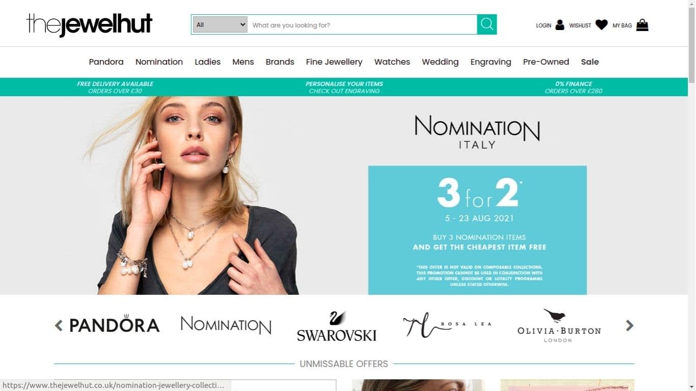
Source: TheJewelHut
For example, let’s say a jewelry website has dedicated 20% of the screen to navbar with a search component in it. Now, is it data backed? Are people really using that search bar to discover jewelry products? Or is it just a random jewelry theme/vendor liability that the jewelry brand is paying for. If most buyers are not using the website search feature, then is there any point in having it in the sticky navbar? I feel it’s required but should only acquire 10% of the screen size and not 20. Again, rather than letting my personal bias take over the business goals, I would do beta tests with different navigational designs for the jewelry website and allow the data to speak WHAT IT FEELS. Accordingly, we shall decide whether the NavBar stays the same with a giant ‘Search’ component or it shrinks for easy search accessibility.
Here are our top tips for designing a stellar navbar for your jewelry website:
- Use a mega dropdown menu to avoid cluttering
- Avoid nested 2nd degree navbars
- Use descriptive labels
- Maintain navigational consistency on web, pwa, and the mobile app
- Go for minimalist graphics in the Navigational menu
Design Customization For Jewelry Websites
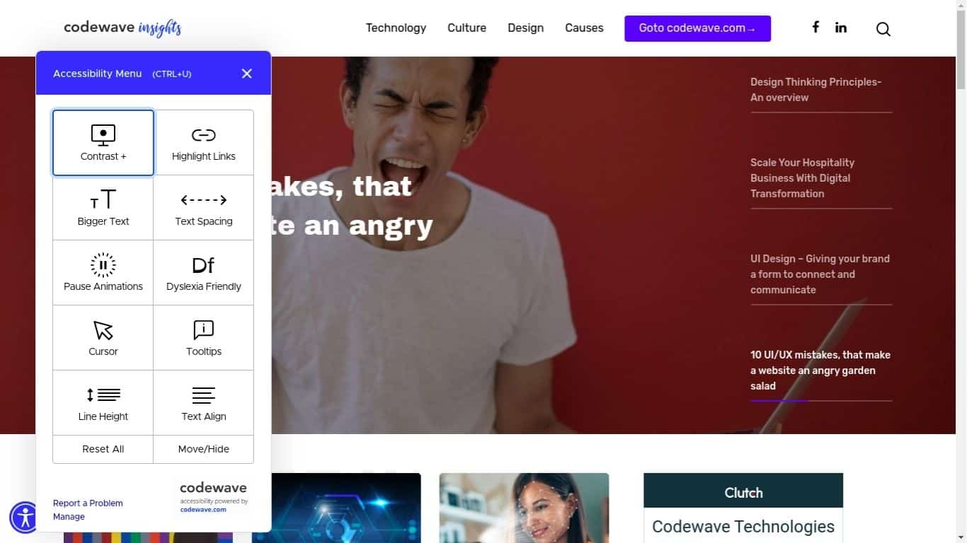
Accessibility features on insights.codewave.com
Customization can enhance the user experience in the best ways. Empower the users to tweak a few options and customize the website for themselves. Your website’s accessibility features can be really impactful as the majority of websites tend to ignore it. But people with disabilities have good purchasing power in the US and UK. Net disposable income in the United States is around $490 Billions for people with accessibility needs, and 24.8 Billion Euros. It’s not just business, but also the impact you can make by incorporating accessibility features into your jewelry website.
Do play with the accessibility features incorporated into this website. Here is the accessibility checklist for you:
- Text/font Color
- Text/font Size
- Text Spacing
- Link Highlighting
- Cursor Visibility
- Horizontal and Vertical Spacing Between Components
- Animation Control Features
Summing it up!
There are multiple avenues to enhance the user experience of your jewelry website, and we have touched on only a few. Website designers often ignore these BASICS, while these are highly effective ways to deliver a seamless online jewelry shopping experience to your users. The ultimate goal of the jewelry website should be to make the website effortlessly usable for the user by making it intuitive to use, and to keep it abreast with the latest fast fashion trends. So, we recommend to depend heavily on the design thinking practices, and take help of an experienced team.
Author Bio –
Ronak Meghani is a serial entrepreneur who has worked with small-medium-large companies. He is a co-founder of Magneto IT Solutions and has been closely working with eCommerce ventures since 2010.
Codewave is a design thinking led digital transformation company enabling organisations with playful innovation using AI & ML, IoT & Edge, AR, VR, Cloud, Blockchain, and Data.


