


Comprehensive Software Consulting Services

IT Architecture Services for Enterprises

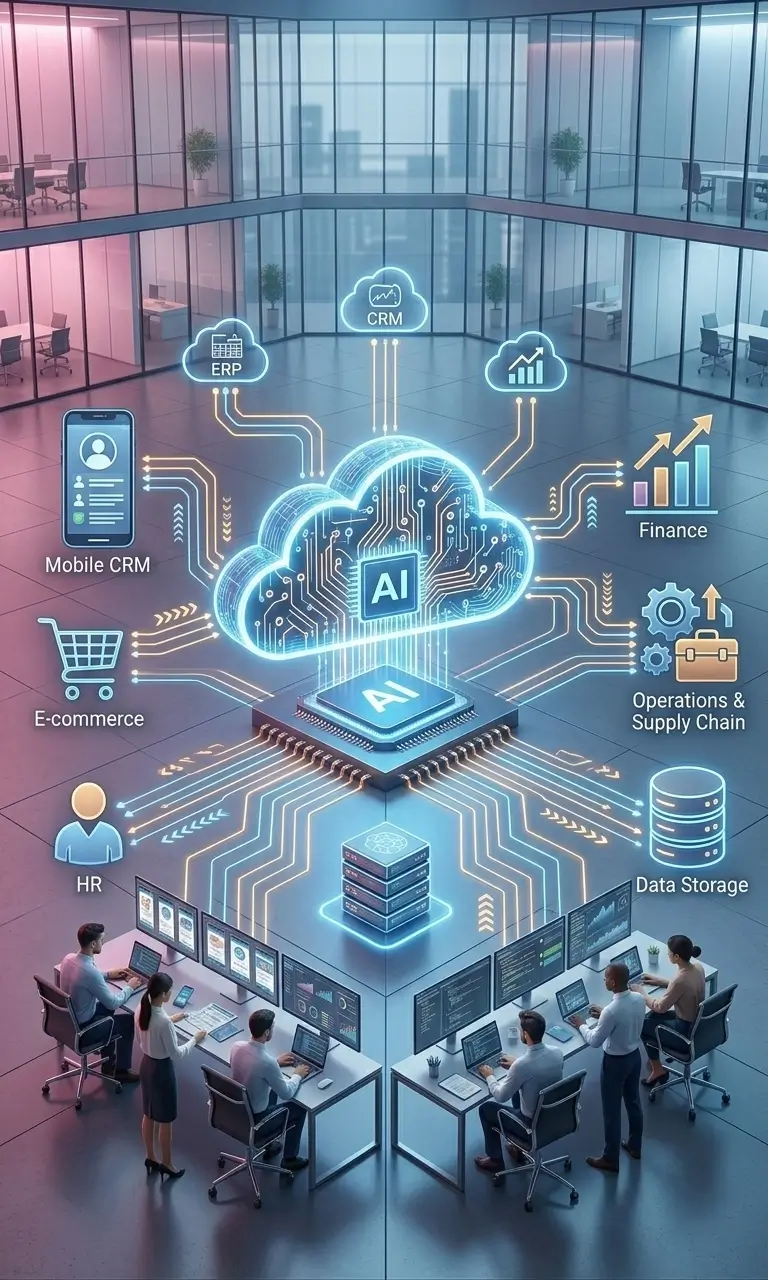
Cloud Software Solutions
Automated Invoice Processing Cloud Service Solutions

Comprehensive Backend Development Services and Solutions

LMS Development Services for Modern Learning Needs
Database Migration Service for Enterprises

AI OCR Solutions for Accurate Document Processing

Enterprise Blockchain Development Services

Cross-Platform Mobile App Development Services

Custom Enterprise Application Development Services

Custom E-Commerce Solutions for Enterprises

Travel Technology Solutions and Services Management

Global Design and Innovation Consulting Services
LLM in Corporate Compliance and Risk Management
Services in Software Development

Travel Technology Solutions and Services
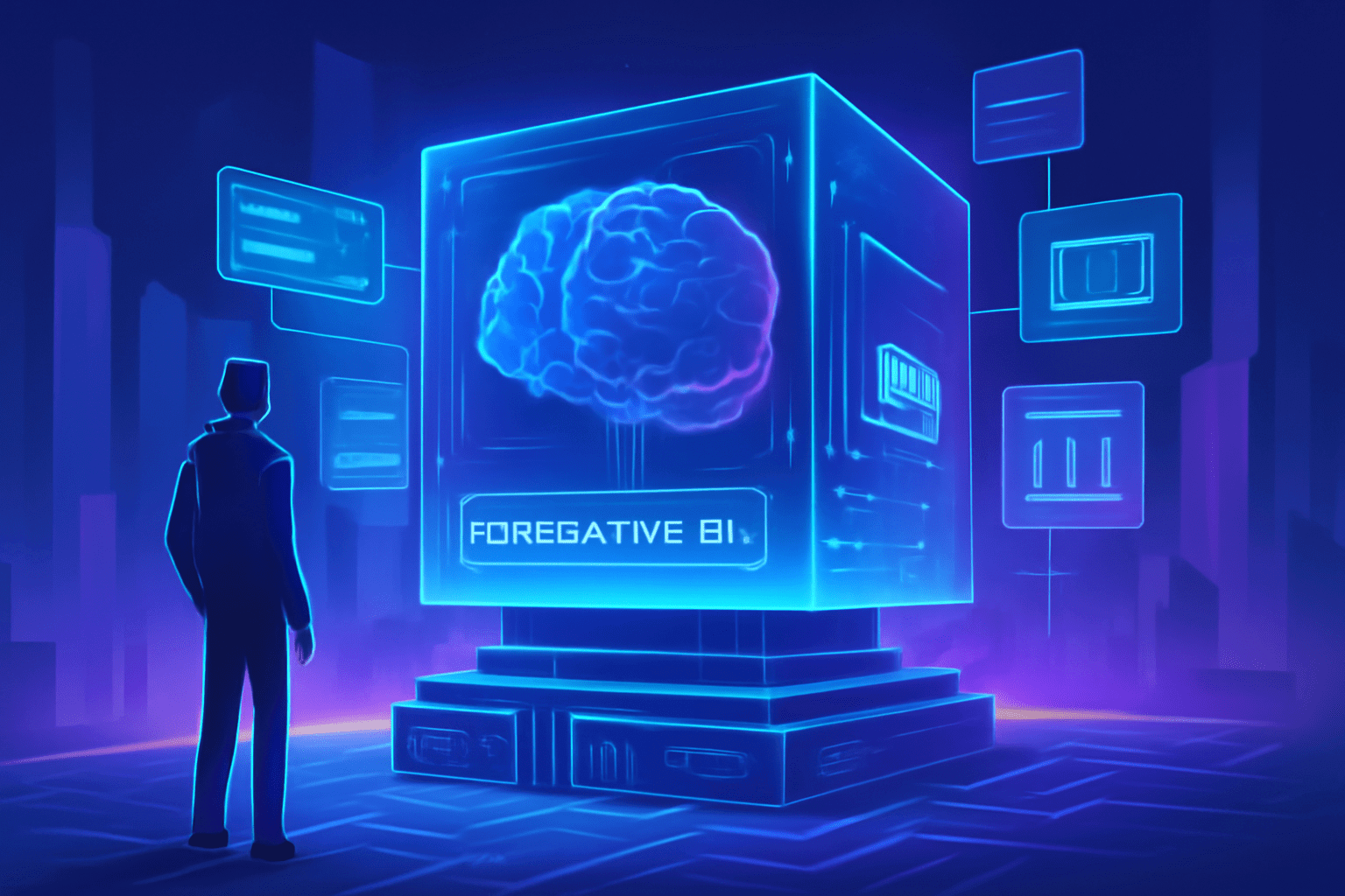
Generative AI Consulting and Strategy for Business Innovation
Application Operations and Management Services
Secure, Reliable Cloud Application Modernization Services
Global Design and Innovation Consulting Services
Enterprise Cloud Consulting & Implementation Services Solutions
Ecommerce Web Design & Development Services
Trusted, Unified Xamarin App Development Services You Need
Custom EHR/EMR Integration Services for Connected Healthcare
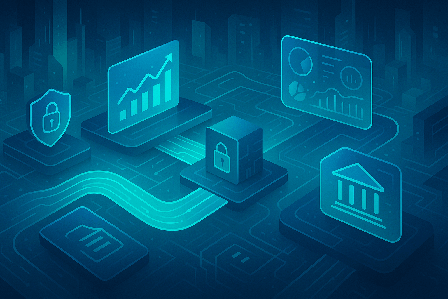
Cyber Security Consulting Services for Scalable Resilience
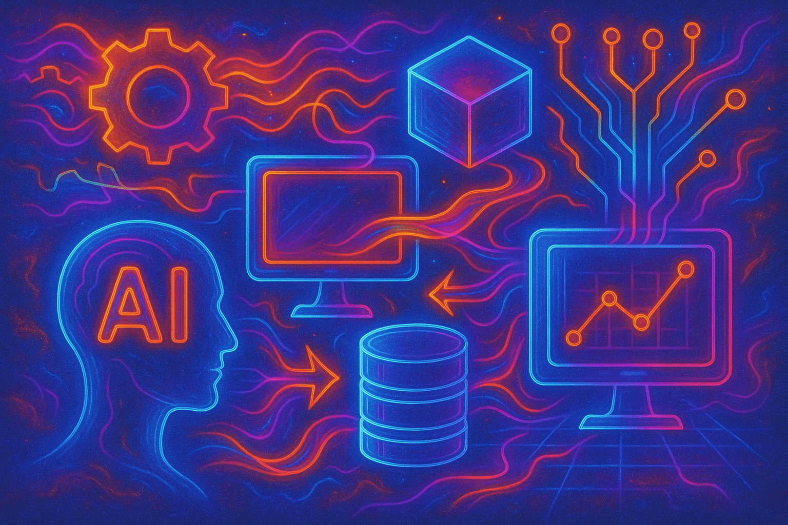
AI and Data Analytics Services Solutions
Enterprise App Development Services
Business Intelligence and Data Analytics Solutions
Convert Your Website into a Mobile App for Android and iOS
Managed Healthcare IT Services and Solutions

Custom .NET Software Development Services & Solutions
Website Design and SEO for Medical Practices and Doctors
Big Data Analytics Solutions & Services
IOT Product Development Services for Faster Decision Making
Cloud-Based E-commerce Solutions and Platforms

Custom Financial Software Development Solutions
Enterprise Automation Solutions and Services

Power Up Digital Change with Strategic Design Thinking Workshops

Design Thinking-Driven Strategic Digital Transformation Blueprint

Generative AI Development Platform
Information Technology Strategy and Consulting Services

Product Design and Development Services

Custom Responsive Web Design Services

Magento eCommerce Development and Design Services

Transportation and Logistics IT Services and Solutions

Decision Intelligence Strategy
Automation for Operational Efficiency

Digital Talent Transformation

Integrated CX And UX Design For Delight

Digital Transformation ROI Measurement

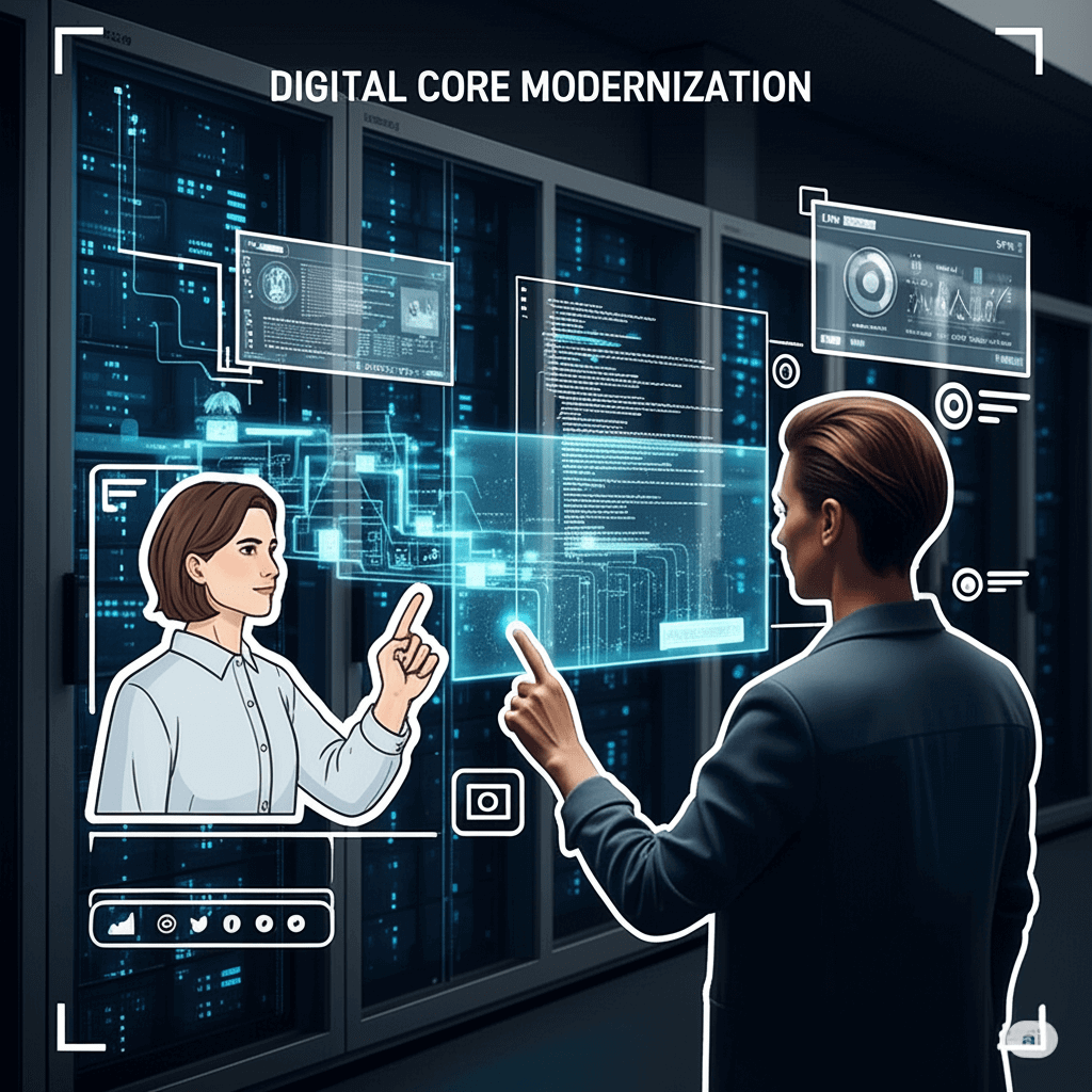
Digital Core Modernization
Cloud Migration Services

AI Accounting Software

Software Product Development Services

Decentralized Finance (DeFi) Development Solutions and Services

Startup Software Development Services
Django Development Company for Scalable Web Solutions
HIPAA Compliance and Advisory Services Solutions
Drupal Development Services
Business Analytics Services

Telemedicine Software Development Services
Support and Maintenance Services for Mobile and Web Applications
Cryptocurrency Development Services and Solutions
AI Testing Services / AI-Powered Testing Services
IT Infrastructure Services
ASP.Net Software Development Services
Retail IT Solutions and Services
Managed Application Services

Data Warehouse Services
Data Science Consulting

Agentic AI Product Design And Development Services

Healthcare Mobile App Development Services
CRM Consulting and Implementation Services
Custom Database Development Services and Solutions
Transportation and Logistics Software Development Solutions
Secure Payment Gateway Integration Solutions
Data Management Services
Java Software Development Services
PHP Development Services
Fast, Scalable, Secure Node.js App Development
Power BI Consulting Services
IT Project Management Services
NFT Token Development Services
DevOps Consulting and Services
Web Data Mining Services
Front-End Development Services
Managed Services for E-commerce Success
Website Redesign Services for Strengthening Your Web Presence
Custom SaaS Development Services
Custom CMS Web Development Services
NFT Marketplace Development Services
Smart Contract Development Services
Oil and gas IT services
AI Audit for Startup Companies | Best Website Audits

PrivateGPT Development Services
Swift iOS App Development Services
Web3 Development Services Company
AI-Native Product Design and Development Services
Personalized Learning with AI for Education
Microsoft Dynamics 365 Customer Service with AI
Energy Management Software Solutions Platform
Human Machine Interface Software Development Service
Education Software Development Services
Retail Software Development Services and Solutions
DEX – Digital Employee Experience Software Services
Decentralized Exchange Development (DEX) Company
Offshore Software Testing Services
Backend Development Services and Solutions
Travel and Hospitality Software Development Services
Fintech Software Development Services
Data Visualization Consulting Services
Digital Solutions For Agriculture and Software Services
Payment Gateway and Software Development Services
B2B Travel Software and Booking
MEAN Stack Development Services
24/7 Managed NOC Services
Database Migration Service
Design-Led AI Consulting for SMEs and Startups
AI Solutions Development Services
P&C Insurance Software Solutions
MLOps Consulting Services
Generative AI Services and Solutions
Conversational AI Platform Development

AI and Analytics for Retail Solutions
Artificial Intelligence Video Chatbot Services
Digital-First Banking IT Services
Golang Development Services
MVP Development Services

eLearning Software Development
Agile Software Development Services
Data Warehouse Consulting and Management Services
IT Services Management Consultancy Services
Learning Management System Consulting Services

iOS App Development Services Company

Ecommerce Services

Marketing Automation and CRM Solutions

Industrial IoT Solutions and Services

Healthcare Data Analytics Solutions

Cryptocurrency Wallet Development

Digital Strategy Consulting Services
B2B Portal Development

Embedded Technology Innovation

Process Automation

XR Application Development

Artificial Intelligence and Machine Learning Consulting Services
Cloud Infrastructure

Blockchain Implementation

Flutter App Development

Angular Development

Mobile Application Testing Tools and Services

Penetration & Vulnerability Testing

QA Testing Services

Reactjs Development

Team Augmentation

Automation Testing
Web App / Portal Development

Python Development

IT Consulting

Custom Software Development

Branding

ReactNative App Development

Web and Mobile App UX – UI Design Services

UX & UI Design

Android App Development

Mobile App Development

Idea to Product
IoT Development

Data Analytics Development

GenAI Development

AI/ML Development

Design thinking

Process Automation
Digital Transformation

Customer Experience Design