


“The best products don’t focus on features, they focus on clarity.”— Jon Bolt
In a world brimming with digital noise, ensuring that your users can effortlessly discover and engage with your content is paramount.
This is where optimized discoverability in UX design comes into play. It’s not just about creating a functional interface but about crafting an experience that intuitively guides your users, making them feel connected and engaged with your brand.
Discoverability in user experience design refers to how easily users can find information, features, and functionality within your digital product. It’s a critical component that influences user engagement, satisfaction, and retention.
While discoverability and findability are often used interchangeably, there is a subtle difference. Discoverability is about users finding new features or content they were not specifically looking for, whereas findability focuses on users locating what they already know they need.
Optimized discoverability can dramatically enhance user engagement by ensuring that users have seamless and delightful interactions with your product. It reduces frustration, increases satisfaction, and promotes retention by making sure users can easily navigate and find value in your digital environment.
In this blog, we’ll delve into the world of discoverability, exploring a range of techniques and patterns you can leverage to create a user-centric experience that fosters exploration and drives business success.
Let’s get into it!
The Role of Navigation in Discoverability
Ever launched a killer new product feature on your website, only to find crickets chirping?
You know it’s fantastic, but users just aren’t discovering it.
Clear navigation is like that enthusiastic salesperson who greets customers, points them towards the latest deals, and highlights hidden gems they might miss.
By optimizing your navigation for discoverability, you can ensure users don’t miss out on the amazing features you’ve worked so hard to create, boosting engagement and driving results for your SME.
Let’s explore some techniques to turn your navigation into a user-friendly salesperson.
Importance of Clear and Intuitive Navigation for User Guidance
Effective navigation is the backbone of a customer-centric design interface. Clear and intuitive navigation ensures that users can effortlessly find their way around your website or application.
When users know exactly where to go and how to get there, their experience becomes more enjoyable, which can lead to higher engagement and longer visits.
Utilizing Breadcrumbs, Well-Organized Menus, and Familiar Icons/Terms
Implementing breadcrumbs, well-organized menus, and familiar icons or terms can significantly enhance navigability.
- Breadcrumbs provide a visual trail that helps users understand their current location within the site’s hierarchy and easily backtrack if needed.
- Organized menus categorize content logically, making it easier for users to find specific sections.
- Familiar icons and terms reduce cognitive load, as users quickly recognize their meanings based on prior experiences.
Implementing Predictive Search to Facilitate Easier Content Discovery
Predictive search further simplifies navigation by anticipating user queries and offering suggestions as they type. This feature not only speeds up the search process but also helps users discover related content they might not have considered initially.
With your navigation now a well-oiled machine, it’s time to ensure users can easily find specific content through effective search functionality.
Effective Search Functionality
While navigation is essential for guiding users, search functionality is the key to quickly directing them to specific content.
Let’s delve into how you can optimize search features to enhance user experience.
- Critical Role of Search in User Experience for Specific Content Discovery
Search functionality is a critical component of UX design, especially when users are looking for specific content. An effective search system allows users to quickly and accurately find what they need without having to navigate through multiple layers of menus.
- Incorporating Autocomplete, Filters, and Advanced Search Options
Incorporating features like autocomplete, filters, and advanced search options can significantly improve the usability of your search function.
- Autocomplete predicts user queries, reducing the time and effort required to type out full phrases.
- Filters allow users to narrow down search results based on specific criteria, ensuring they find the most relevant content.
- Advanced search options provide more control and precision, catering to users who need detailed and specific information.
Read: Usability Versus Security: Balancing the Possible and the Impossible
- Importance of Clear Placement and Recognizable Icons for Search Fields
The placement and design of the search field are also crucial. It should be prominently placed and easily recognizable, often at the top of the page.
A magnifying glass icon is universally understood as a symbol for search, making it a reliable choice for your search field design.
Now that users can easily search and find what they need, it’s time to enhance discoverability through strategic visual design and hierarchy.
Visual Design and Hierarchy
You’ve streamlined navigation and search, but guiding users’ attention requires more. Visual design and hierarchy play a pivotal role in this.
Visual design is a persuasive language – it can tell a story, evoke emotions, and most importantly, guide user attention. By strategically leveraging color, contrast, typography, and visual cues, you can create a user interface that feels intuitive and effortless to navigate.
Let’s explore the secrets of using visual design to enhance discoverability.

Utilizing Color, Contrast, and Typography to Guide Users’ Attention
Visual design plays a significant role in guiding users’ attention and enhancing discoverability. Here are three aspects of visual design that you need to get spot on for optimal discoverability:
- Color: Colors can be powerful indicators in UX design. Different colors can signify different types of content or actions, providing visual cues that help users understand the interface at a glance.
For example, using a distinct color for call-to-action buttons can make them stand out, prompting users to take the desired action. Additionally, color can be used to categorize information, creating a visual grouping that simplifies navigation.
- Contrast: High contrast between text and background ensures readability, which is essential for user engagement. Text that blends into the background can be difficult to read and may cause users to abandon the page.
By ensuring a strong contrast, you can make sure that your content is accessible to all users, including those with visual impairments.
Contrast can also be used to draw attention to specific elements on the page, such as buttons or important messages.
- Typography: Typography involves more than just choosing a font. It encompasses the size, weight, and style of text, all of which contribute to the overall readability and hierarchy of information.
Large, bold headings can guide users through the content, signaling the importance of different sections. Consistent use of typography creates a sense of order and predictability, helping users to quickly understand the structure of the information presented.
Employing Visual Cues Like Icons and Images to Highlight Key Features
Visual cues such as icons and images are essential design thinking tools for guiding users through an interface. These elements can provide quick visual references, making it easier for users to find what they need without reading through large amounts of text.
- Icons: Icons are universally recognized symbols that can represent actions, features, or sections of a website.
For example, a shopping cart icon immediately signals an e-commerce function, while a magnifying glass icon typically represents a search function.
By using familiar icons, you can reduce the cognitive load on users, making the interface more intuitive.
- Images: Images can break up text, making a page more visually appealing and easier to scan. They can also be used to highlight key features or sections of content.
For example, a hero image at the top of a landing page can draw attention to a new product or service, while smaller images throughout the page can illustrate points and provide visual interest.
Organizing Content Logically to Ease Discovery Through Visual Hierarchy
A clear visual hierarchy is essential for helping users discover and navigate through your digital product. By organizing content logically and prioritizing it based on importance, you can create a more intuitive and user-friendly experience.
- Content Prioritization: Prioritizing content involves arranging information in a way that reflects its importance.
Key information should be placed prominently, while secondary details can be positioned further down the page. This approach ensures that users see the most important information first, reducing the likelihood of them missing critical content.
- Layout and Structure: The layout and structure of your content should guide users naturally from one section to the next. Using grid systems and consistent spacing can create a sense of order, making it easier for users to follow the flow of information.
Additionally, dividing content into clearly defined sections with headings and subheadings helps users to scan the page and find what they are looking for quickly.
- Visual Cues and Grouping: Grouping related content together and using visual cues such as lines, boxes, or background colors can help users understand the relationships between different pieces of information.
This not only aids in discoverability but also enhances the overall user experience by making the content more digestible.
By focusing on these aspects of visual design and hierarchy, you can create an engaging and intuitive user experience that enhances discoverability.
This approach not only makes it easier for users to find what they are looking for but also encourages them to explore and interact more deeply with your digital product.
When we explore the role of visual design and hierarchy in guiding users’ attention, Codewave’s approach to UI-UX design is a prime example of how these elements can be optimized.
We use bold, modern designs that not only capture attention but also make navigation intuitive. Our design team expertly applies color, contrast, and typography to create a visual hierarchy that naturally leads users to explore deeper into the digital environment.
Visual design and hierarchy lay the groundwork, but users also need timely access to information. Let’s explore progressive disclosure and contextual help next.
Progressive Disclosure and Contextual Help
Once your visual design captures users’ attention, managing the complexity of information becomes vital. Progressive disclosure and contextual help can make this process seamless.
Ever felt like you’re drowning in a sea of information? The same can happen to your users if they’re bombarded with every feature and function at once.
Let’s explore how to implement progressive disclosure effectively, along with providing contextual help exactly when and where users need it most.
Revealing Information and Features as Needed to Prevent User Overwhelm
Progressive disclosure is a powerful UX design technique that involves revealing information and features to users gradually, based on their needs and actions.
This method prevents users from feeling overwhelmed by too much information at once and allows them to focus on the task at hand without distraction.
- Preventing Information Overload: One of the main goals of progressive disclosure is to manage cognitive load by presenting only the necessary information at any given time. When users are bombarded with all the features and options upfront, they can easily become confused and frustrated.
By breaking down the information into manageable chunks and revealing it step-by-step, users can better understand and engage with the interface.
- Enhancing User Focus: By progressively disclosing information, you help users maintain focus on their current task.
For example, an e-commerce site might initially show only the most important product details, with additional specifications available through expandable sections.
This way, users can concentrate on the main information first and access more details as needed.
- Contextual Relevance: Progressive disclosure ensures that information is provided in a contextually relevant manner.
For instance, advanced settings and options can be hidden under an “Advanced” tab or button, which only appears when the user shows interest in exploring more.
This approach keeps the interface clean and straightforward, presenting complexity only when it is truly required.
As we delve into progressive disclosure and contextual help, it’s important to mention how Codewave incorporates these strategies into their UX designs.
Our team designs interfaces that reveal information and features as needed, preventing user overwhelm and enhancing focus. This approach is part of our broader strategy to create responsive, engaging digital products that maintain clarity and ease of use across all user interactions.
Read: Creating a Solution Architecture Document for High-Level Design
Benefits of Accordions and Tabs for Managing Content Complexity
Using interactive elements like accordions, tabs, and modals can help implement progressive disclosure effectively.
Accordions and tabs allow users to expand or switch between sections, revealing more information without cluttering the interface. Modals can provide in-depth information or additional features without navigating away from the current page.
Designing Effective Onboarding Processes, Interactive Tutorials, and Tooltips for User Guidance
Effective onboarding processes, interactive tutorials, and tooltips are essential tools for guiding users through your digital product. These elements help users understand and utilize your product’s features, leading to a more satisfying and engaging user experience.
1. Onboarding Processes
- Welcome Tours: Guide new users through essential features with a series of pop-up messages or steps highlighting key functionalities. Keep the tour concise to avoid overwhelming users.
- Interactive Walkthroughs: Engage users with hands-on activities that guide them through specific tasks or workflows. Adapt these walkthroughs to the user’s progress, providing help and hints as needed.
2. Interactive Tutorials
- Step-by-Step Guides: Break down complex tasks into smaller, manageable steps with clear instructions and feedback. Enhance these guides with visuals, animations, or video clips for a more engaging learning process.
- Task-Based Learning: Focus on real-world scenarios and use cases to teach users how to accomplish specific tasks relevant to their goals, ensuring practical and immediately applicable knowledge.
3. Tooltips
- Contextual Help: Provide immediate, in-context help with small pop-ups that offer additional information or tips when users hover over or click on specific elements. This reduces the need for users to search for help or consult documentation.
- Non-Intrusive Guidance: Tooltips appear on demand and disappear when no longer needed, ensuring that the interface remains uncluttered and users are not taken away from their current tasks.
- Enhancing Usability: Offer additional information through tooltips to enhance the overall usability of your product. Users can access detailed explanations or tips without navigating away from the main interface, leading to a more fluid and intuitive experience.
By strategically implementing these techniques, you can create a user experience that feels like a captivating conversation, not a confusing lecture. Users will discover new features and functionalities organically, fostering a sense of empowerment and deeper engagement with your product.
Personalization and User Feedback
Beyond design and navigation, personalizing the user experience and incorporating their feedback can significantly enhance discoverability. Here’s how you can achieve that.
User Profiles and Recommendations
Utilize user profiles to personalize the interface and recommend features or content that aligns with their interests and past interactions. This can be a powerful tool for helping users discover hidden gems within your product.
Read: Understanding the Agile Design Process and its Principles
A/B Testing and User Feedback
Don’t be afraid to experiment! A/B testing allows you to compare different design variations and see which ones lead to better discoverability.
Additionally, actively solicit user feedback through surveys and usability testing to gain valuable insights into how users interact with your interface and discover features.
Consider this: Codewave, a design-thinking focused UX/UI design agency, leverages a human-centered approach to craft user experiences that prioritize user needs and expectations.
Through a combination of user research, design thinking workshops, and usability testing, Codewave helps businesses like yours ensure optimal discoverability within their digital products.
While personalizing experiences, it’s also important to ensure accessibility for all users. Let’s delve into accessibility in UX design next.
Accessibility in UX Design
Making your product accessible is not just about compliance; it’s about ensuring everyone can interact with your digital product.
Accessibility in UX design involves following best practices and guidelines to create an inclusive user experience. Let’s explore how to achieve this comprehensively.
Ensuring Content is Navigable and Interactable for All Users, Including Those with Disabilities
Accessibility in UX design means ensuring that your content is navigable and interactable for all users, including those with disabilities. This involves:
- Following Accessibility Standards: Adhering to standards such as the Web Content Accessibility Guidelines (WCAG) ensures that your product meets accessibility criteria.
- Inclusive Design: Designing with inclusivity in mind from the outset, rather than retrofitting accessibility features later, ensures a more seamless user experience for everyone.
- User Testing with Diverse Groups: Involving users with disabilities in your testing processes helps identify real-world accessibility issues and gather practical insights.
Principles of Accessible Design
| Principle | Description |
| Perceivable | Information and user interface components must be presentable to users in ways they can perceive. |
| Operable | User interface components and navigation must be operable. |
| Understandable | Information and the operation of user interface must be understandable. |
| Robust | Content must be robust enough to be interpreted reliably by a wide variety of user agents, including assistive technologies. |
Using Readable Fonts/Colors, Alt Text/ARIA Labels, and Consistent Navigation Schemes
To ensure your content is accessible, consider the following techniques:
1. Readable Fonts and Colors
- Readable Fonts: Choose fonts that are clear and legible. Avoid overly decorative fonts for body text and ensure that font sizes are sufficient for readability. Use a minimum of 16px for body text to enhance readability.
- Color Contrast: Ensure high contrast between text and background to make text readable for users with visual impairments. Use tools like the WebAIM Contrast Checker to verify sufficient contrast ratios.
2. Alt Text and ARIA Labels
- Alt Text: Add alternative text to images so that screen readers can describe the content to visually impaired users. Alt text should be concise and descriptive.
Example: <img src=”image.jpg” alt=”A group of people working on a project”>
- ARIA Labels: Use ARIA (Accessible Rich Internet Applications) labels to provide additional context to interactive elements, ensuring they are accessible to screen readers.
Example: <button aria-label=”Close menu”>X</button>
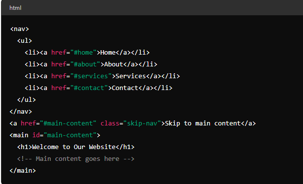
3. Consistent Navigation Schemes
- Consistency: Use a consistent layout and navigation scheme across your website. This helps all users, including those with cognitive disabilities, navigate your site more easily.
- Skip Navigation: Implement “skip navigation” links to allow users to bypass repetitive navigation links and jump directly to the main content.
Example: <a href=”#main-content” class=”skip-nav”>Skip to main content</a>
4. Example of Accessible Navigation
Below is an example of an accessible navigation structure:
Accessible Design Checklist
To ensure your site meets accessibility standards, use this checklist:
| Checklist Item | Yes/No |
| High-contrast text | |
| Readable font sizes | |
| Alt text for all images | |
| ARIA labels for interactive elements | |
| Consistent navigation schemes | |
| “Skip to main content” links | |
| Keyboard navigable interface | |
| Accessible forms with labels | |
| Responsive design for various devices | |
| Tested with screen readers |
By following these guidelines and principles, you can create a more inclusive digital experience that ensures all users, regardless of their abilities, can navigate and interact with your content effectively.
Read: The Impact of AI & Emerging Technologies on UI/UX Design Service
Cross-platform Consistency
Building on the foundation of an inclusive user experience, cross-platform consistency ensures that discoverability remains seamless regardless of the device users choose to interact with your product.
Imagine a world where everyone can access and interact with your website or app, and on top of that, they can find the features they need with ease – no matter if they’re using a desktop computer, a tablet, or a mobile phone.
That’s the power of combining accessibility with cross-platform consistency in UX design.
Here’s how to achieve cross-platform consistency:
- Responsive Design
Utilize responsive design principles to ensure your interface adapts seamlessly to different screen sizes and devices.
This means your navigation, content hierarchy, and visual design should all translate effectively across platforms, maintaining a familiar and discoverable experience for users regardless of their device.
- Platform-Specific Conventions
While maintaining consistency, it’s important to acknowledge some platform-specific conventions.
For instance, hamburger menus are a common navigation element on mobile devices, whereas they might be less prominent on desktops. By understanding these subtle nuances, you can ensure a native feel for users on each platform without sacrificing discoverability.
Codewave, with its expertise in UI/UX design across various platforms, can help you craft a seamless user experience that fosters discovery on any device.
Our team of designers understands the intricacies of responsive design and platform-specific conventions, ensuring your product feels intuitive and discoverable for all users.
Measuring and Monitoring Discoverability
So you’ve implemented these discoverability techniques – but how do you know if they’re working?
To understand how well your design is performing and where improvements are needed, it’s important to measure and monitor discoverability.
Here’s how you can do it effectively.
Using Analytics, Heatmaps, and Clickmaps to Understand User Interactions and Discoverability Issues
Analytics, heatmaps, and clickmaps are powerful tools for understanding user interactions and identifying discoverability issues. These tools provide detailed insights into how users navigate your site, what they click on, and where they spend the most time.
Analytics
Analytics platforms, such as Google Analytics, track a wide range of user behaviors and provide comprehensive reports on how users interact with your site. Key metrics to monitor include:
- Page Views: The number of times a page is viewed.
- Average Session Duration: The average time users spend on your site.
- Pages per Session: The average number of pages viewed per session.
- User Flow: The path users take through your site.
Example: Google Analytics Dashboard
| Metric | Description |
| Page Views | Total number of pages viewed |
| Average Session Duration | Average time spent on the site |
| Pages per Session | Average number of pages viewed per session |
| User Flow | Path users take through the site |
Heatmaps
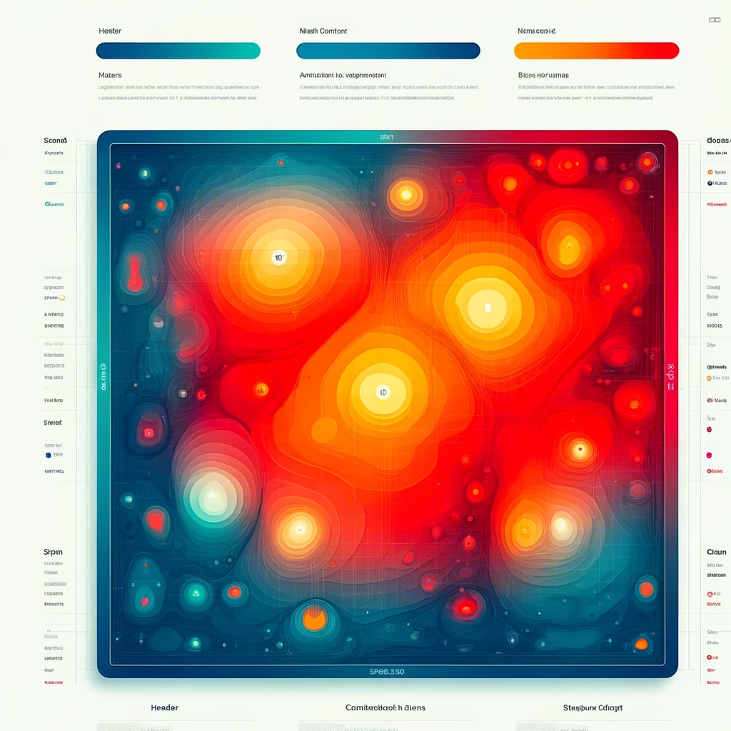
- Click Heatmaps: Show where users click the most on a page.
- Scroll Heatmaps: Indicate how far down the page users scroll.
- Move Heatmaps: Track mouse movement patterns.
Clickmaps
Clickmaps specifically show where users are clicking on a webpage. This helps in understanding which elements are being interacted with and if users are engaging with the intended content.
| Clickmap Analysis | Insight Gained |
| High Click Areas | Identify which elements (links, buttons) receive the most clicks. |
| Low Click Areas | Discover which elements are being ignored, indicating potential discoverability issues. |
| Unexpected Clicks | Find out if users are clicking on non-clickable elements, suggesting confusion or misplaced expectations. |
Employing Metrics Like Click-Through Rates and Bounce Rates for Evaluating UX Improvements
Metrics like click-through rates and bounce rates are essential for evaluating the effectiveness of your UX improvements. These metrics help you understand user engagement and identify areas needing optimization.
Click-Through Rate (CTR)
Click-through rate measures the percentage of users who click on a specific link or call to action (CTA) relative to the number of users who view the page or link.
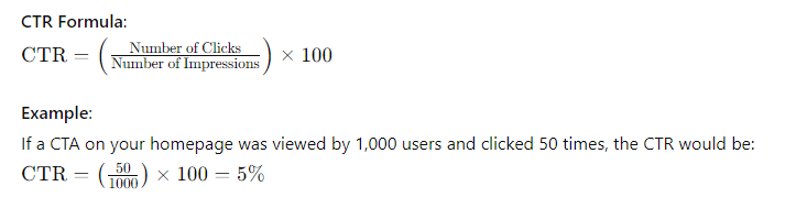
A high CTR indicates that users are finding and engaging with your links effectively, while a low CTR suggests the need for improvement in link placement or CTA design.
Bounce Rate
Bounce rate is the percentage of visitors who leave your site after viewing only one page. A high bounce rate can indicate that users are not finding what they are looking for or that the content is not engaging enough.

A low bounce rate indicates that users are engaging with multiple pages on your site, suggesting better discoverability and user satisfaction.
Example Table for Key Metrics
| Metric | Ideal Range | Interpretation |
| Page Views | Higher is better | Indicates high interest in your content. |
| Session Duration | 2-3 minutes+ | Longer durations suggest users are engaged with your content. |
| Bounce Rate | Below 40% | Lower rates indicate users are exploring more of your site. |
| Click-Through Rate | 2-5%+ | Higher CTRs show that users find your CTAs and links compelling and relevant. |
Once you’ve optimized your UX design for discoverability, it’s crucial not to rest on your laurels. Ongoing evaluation through analytics, heatmaps, and user feedback is just the start.
A comprehensive design teardown, similar to the services offered by Codewave, can further elevate your design’s effectiveness. This process entails a critical, detailed examination of your existing UX/UI to ensure it truly captures the essence of your brand and resonates with your target audience.
Challenges and Opportunities
Optimizing discoverability is an ongoing process. Here are some challenges you might encounter:
Balancing Content Relevance with Information Overload
Striking the right balance between showcasing all your features and overwhelming users with information is crucial. Utilize progressive disclosure and clear hierarchy to present content in a digestible way.
Accommodating Diverse User Habits and Expectations
Users come with varying levels of technical expertise and expectations. Consider user personas and conduct user research to understand how different user groups discover information within your interface.
The Evolving Landscape of Technology
New technologies and user trends are constantly emerging. Stay informed about the latest advancements in UX design and adapt your discoverability strategies to keep pace.
Despite these challenges, the opportunities associated with optimized discoverability are immense:
Increased User Engagement and Retention
When users can easily find what they need, they’re more likely to stay engaged and come back for more. Discoverability fosters a sense of empowerment and control, leading to a more positive user experience.
Improved Brand Perception
A well-designed interface that prioritizes discoverability reflects positively on your brand identity. Users appreciate the ease of use and intuitiveness, leading to increased brand loyalty and advocacy.
Enhanced Conversion Rates
By making it easier for users to discover the value proposition of your product, you can increase conversion rates and achieve your business goals.
Read: How to Increase Brand Visibility and Awareness
Conclusion
Optimizing discoverability in UX design is crucial for creating engaging, user-friendly experiences. By focusing on clear navigation, effective search functionality, strategic visual design, progressive disclosure, personalization, and accessibility, you enhance how users interact with your digital products.
Discoverability impacts user engagement, satisfaction, and retention by ensuring users can easily find and interact with necessary content and features. Techniques such as high-contrast text, readable fonts, alt text for images, ARIA labels, and consistent navigation schemes ensure inclusivity.
Measuring and monitoring discoverability through analytics, heatmaps, and clickmaps helps understand user behavior and identify improvement areas. Metrics like click-through rates and bounce rates provide insights into UX effectiveness, guiding data-driven decisions.
At Codewave, we excel in creating immersive user experiences through our UX & UI design services.
Our approach combines design thinking with digital innovation, ensuring that your products not only meet but exceed user expectations. By leveraging our expertise, you can build high-impact products ready for scale, enhancing discoverability and driving engagement.
Ready to transform your digital experience with optimized discoverability? Contact us today to see how we can help you design user-friendly, engaging interfaces that drive engagement and growth.
Codewave is a design thinking led digital transformation company enabling organisations with playful innovation using AI & ML, IoT & Edge, AR, VR, Cloud, Blockchain, and Data.