The shift from ‘isolated focus on profits’ to focusing on people/customer-centricity to fuel holistic organisational growth has lately been a trend for the past few years in almost all industries. In the BFSI sector as well, companies are innovating and developing new digital solutions to enhance customer experience. Banking & Finance institutions are actively embracing digital transformation technologies & projects to gain an edge over competitors.
You can easily estimate the surge in the demand for digital transformation in the BFSI as this segment is growing at a CAGR of 15.4% and is predicted to be a USD 164Bn+ opportunity.
Real-time robo advisory, core banking solutions/services through digital platforms, contactless payments, digital lending & investment platforms, RegTech & compliance, AI/ML led customer help centres, data-led intelligent fraud identification & prevention, Blockchain led banking transparency, and a lot more is helping BFSI companies to tap into the new potential unlocked with the digital technologies.
But will it be simply enough to avail the banking services via a digital platform? It’s often not. A very fancy product which nobody uses is useless. As simple as that.
So, what should be done?
You as a banking professional need to embrace a robust design thinking approach to building effective useful banking digital solutions. Design thinking led digital transformation of banking organisations is the way forward. Proper design thinking yields anywhere from 85% ROI to 107%. Later in the article, we discuss & analyse a few real-world banking apps which we have used, and decode what they are doing right, and what could be improved by applying design thinking principles to them.
What’s design thinking?
Design thinking is an approach to build human-centric solutions. Often, people get confused that it is something related to graphics, UI, UX, and aesthetics. But it is beyond visual design, it is about thought-process, practises, research, analytics, and decision making. For BFSI, it could start with putting yourself in the shoes of the banking customer/user for whom you’re building solutions. You empathize with your user, their background, the language they speak, and the culture they come from. You observe their behaviour, understand their needs, learn about the problems they are facing while using banking services from digital media, unlearn your own biases/assumptions, and re-learn about how the user interacts with the platform and validate any hypotheses which you may have.
For example, if a lot of new banking customers are abandoning your app while signing up for your platform, then you may revisit your sign-up process to make it more intuitive and easy to use. How do you do that? First, you need to find out that users are actually abandoning the app. This is achievable by building analytics and user behaviour tracking capabilities within your app. Next, you can talk/interview a lot of prospects and ask them to use your platform from downloading to sign-up, and transacting money. Take their feedback, assess it, analyse with an unbiased mind. Identify the scope of improvements, implement if any. And then, iterate this process unless and until you get your desired results.
On a broad level, the purpose of Design Thinking is to humanize the offered products, services, and processes in an innovative manner. Read more about design thinking with some case studies here.
Design Thinking Applied To The BFSI sector
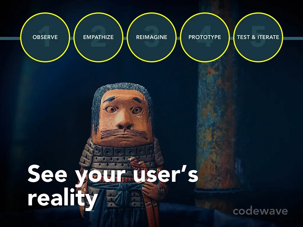
Design Thinking in the banking sector aids in the architectural design for financial products. These include the defining and understanding of all the possible problems for the target audience, prioritizing the ones that need to be addressed immediately, assess available solutions, and then shortlist the one with the most efficient potential outcomes. Thereafter, you can start implementing the solution and iteratively improve your solution.
- EMPATHISING WITH THE USER PROBLEMS.
A major challenge in the digital transformation of the banking sector is to completely transform the customer’s journey and interactions with the bank. As the saying goes, your app is the bank now. This in clear terms means that the services that were easily accessible offline are to be presented digitally with enhanced value, ease-of-use, and convenience. Your customers were visiting banks and waiting for hours in queue to withdraw/deposit money, update passbooks, apply for loans, and whatnot. But now, all these banking activities are available at a click away. What’s the modern day banking challenge then? It’s about designing intuitive UI/UX and making the transactions and interactions with the app free from any flaws. It’s about ensuring that your app is secure and operational in varying network bandwidths. It’s about making it ridiculously easy for the banking users to use/view/plan all their financial assets within an app or a suite of apps.
For example, a family (let’s say a couple) wants to keep a tap on their cumulative expenditure behaviour, credit limit usage, monthly EMIs, savings for their kids higher education or savings for buying a house in the future, and also wants to view how much they have invested in stocks, the returns, the taxes they are liable to pay, etcetera. How many of these could you offer in your banking app? Would it make sense for your banking business to broaden your services and cover most of these?
Basically, by empathising with the end user, you build solutions that are useful to them. You also get a clear picture of what their needs are, and you could map it to your capabilities to understand how you can help them meet their needs.
- DEFINING THE IDENTIFIED PROBLEM.
Empathising and observation is not a one time affair. It’s a continuous iterative process. So, though we are in step 2, we have to continue to empathise and observe. After the identification of major problems that need immediate solutions. It is necessary to further break the problem into smaller subproblems and map it with different user personas. This is important for ensuring that the solution is going to be useful for at least a segment of users and ensures good speed and organisational agility.
For example, if you’re developing a stock market trading application, it’s a good idea to include an in-app calculator that gives you real-time insight about your profits and losses by taking into picture intraday and delivery taxes.
- IDEATING THE MOST EFFICIENT SOLUTION
Ideation of solutions for the defined problems requires aggressive brainstorming in order to be able to provide efficient solutions. Ideally, there shouldn’t be any bottlenecks to flow of ideas. Let everyone contribute is the philosophy of design thinking approach. To date, a lot of organisations only allow top level executives to throw in ideas, which is something not suitable for the design thinking approach. In the design thinking led digital transformation projects, you invite and celebrate ideas & feedback coming in from all the stakeholders. At Codewave, we have this philosophy that goes – ‘everyone is a design-thinker’. In other words, ‘design thinking is everyone’s role’.
For instance, if we are building a digital app for managing credit/payment cards, then people can throw in multiple ideas like
- it would make sense to also have a chat app immediately accessible via a floating button from any screen on the payment card management app. Or,
- Maybe there could be a 24×7 call access to speak with real humans over voice as banking is an industry where fraud can mean serious losses, and thus people are always insecure in some way.
Trust in the brand has a big role to play in the success of BFSI companies, and having a human available at a click away is a good way to build trust.
But accessing these ideas on the basis of feasibility, option 1 seems to be easy to implement, and so we can proceed with it for now, and in the later phases we may look at option two as well if necessary.
- PROTOTYPING THE DIGITAL BANKING PRODUCT
After the ideation of the possible solution to the identified challenges. The next task is to prototype solutions for defined use-cases and user personas. This is doable with paper or digital wireframes, or an MVP of the product with barebone design.
- ITERATION OF THE FINAL PRODUCT
The next stage of the design thinking process is to thoroughly test the MVP/prototype, identify the loopholes, and the scope of improvements. The test group could be internal team members, a special testing team, or real-word users, etcetera. Feed the learnings, observations, and feedback of real-world users from this stage back into the design thinking loop, and iteratively improve the prototype until you are satisfied to push the product to the real users.
At times, the principles of design thinking seems to be a no-brainer. But it is not that simple, else why would 70% of digital transformation projects fail? As promised, we are sharing a deeper analysis of two of the banking apps that we use as a banking user, with honest feedback.
Real-world, in production Banking app analysis
It might sound like a rant, but one of the apps here is really irritating, while the other one is cool. But there is no bias involved in the feed other than pure customer feedback. Using the real world apps accessible to you, you may also analyse a few different banking applications and observe what works for them and what might be working against them. The banks that we have picked are the top ones in India. The analysis is done on the usability, interactiveness, and UI/UX in general.
Case 1: A major large cap bank in India
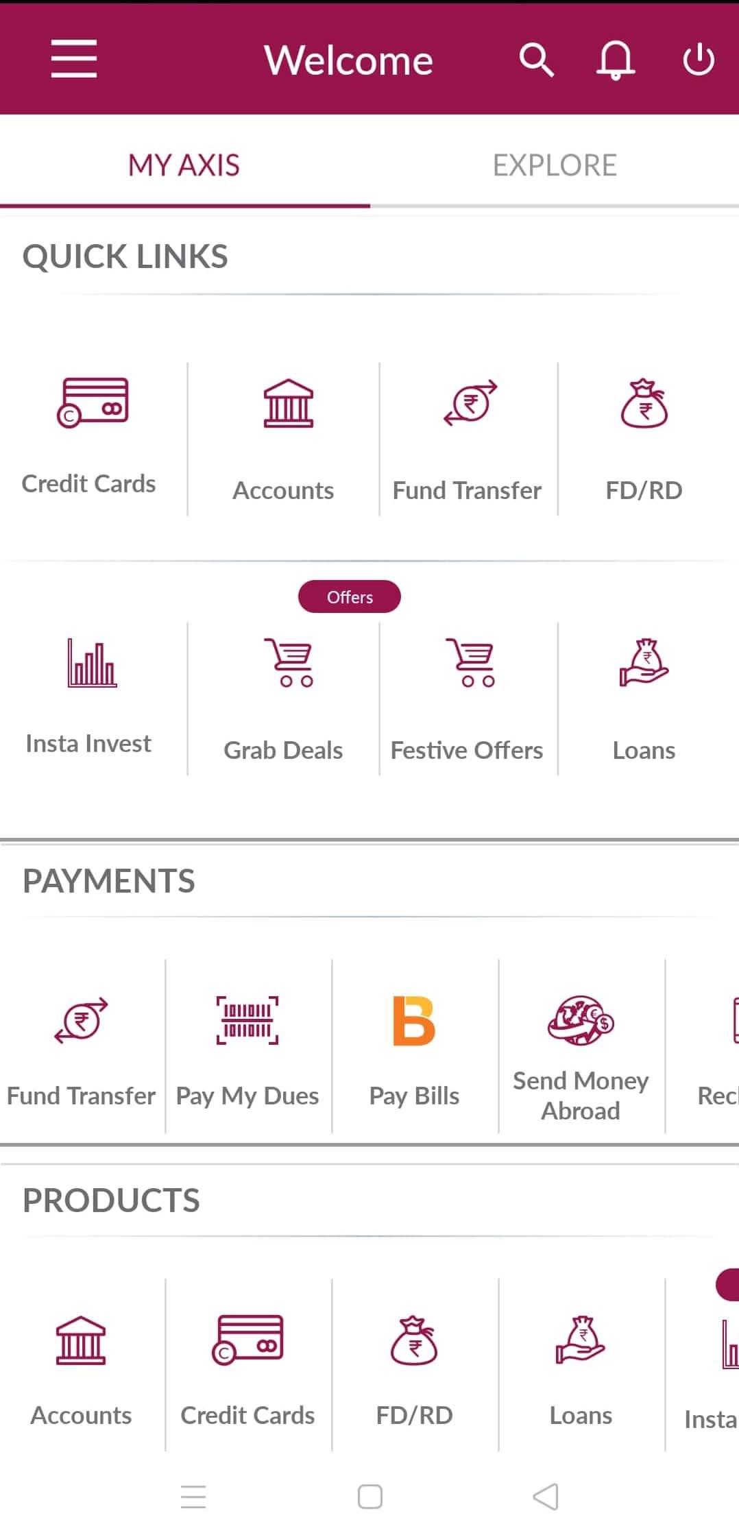
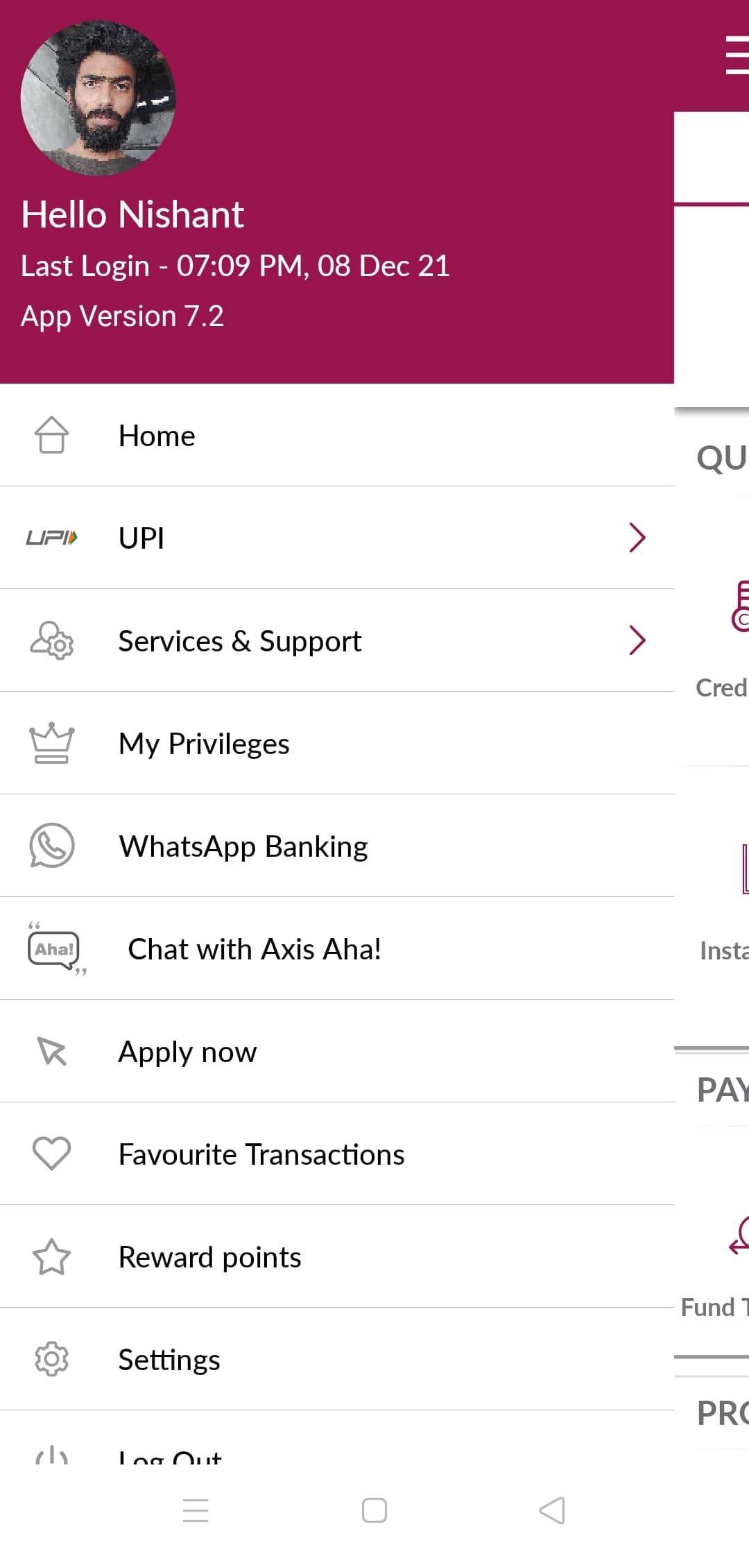
- One of the pioneers in the banking sector. It was surprising to see how aggressive they have been from the very beginning with their web and mobile banking apps. While the mobile app is very intuitive and easy to use, it is quite demanding in terms of network bandwidth, works really well when in a good network but keeps buffering in the low bandwidth region.
- A lot of day to day banking functionalities are just a tap away, from credit card to loan accounts, to EMIs, UPI, Account details, Loans, and so much more. This is good. The same is accessible from the menu as well. So, it is a clear observation that they have invested a lot on user personas, as someone who is a lot active on social media (gen-z) would usually scroll a screen to find a feature, while someone who has been a lot active on the web may want to access features from the menu tab. Right?
- They have customer care numbers available from within the app at just two clicks away from any screen.
- To ensure high security, they have an mPIN facility in place. Plus they have two factor authentication, and from within the app you can change your ATM PIN, UPI PIN, etcetera.
- What could be further improved? The largest public sector bank in India is ahead of some of the private sector banks when it comes to customer convenience. For example, the largest public sector bank in India allows its customers to change their address, phone number, and bank branch from within the app. While this app that we review, as on the date of review, lacked the functionality to change the address/phone without visiting the branch.
Case 2: A crisis hit bank in India
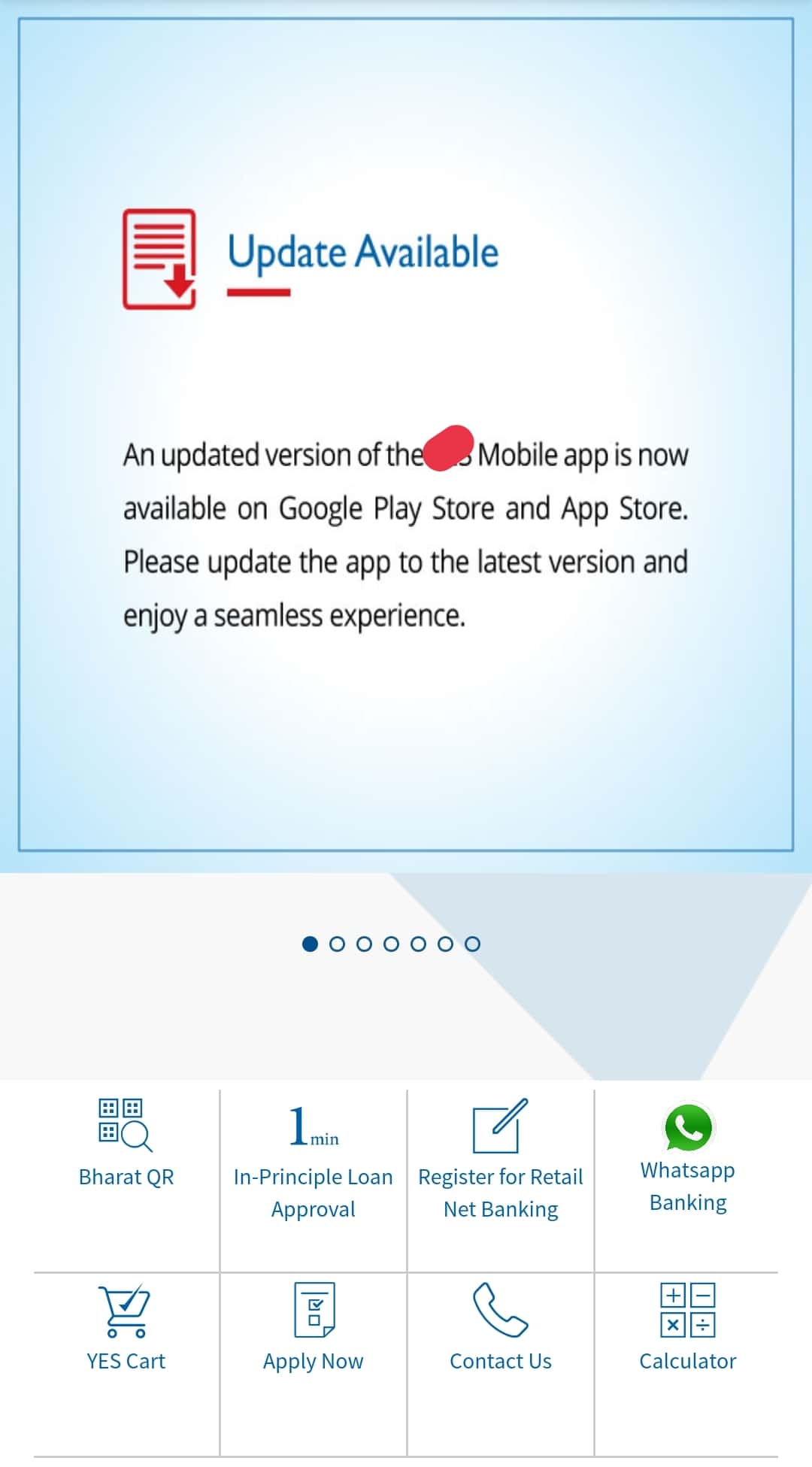
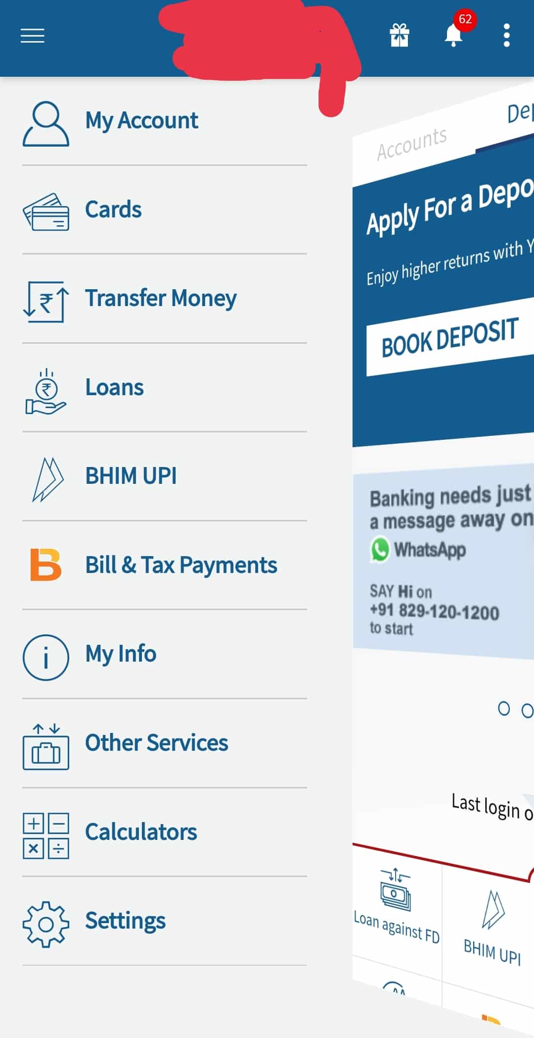
- Okay, we do understand the bank is going through a lot as they hit a crisis recently (read it as an internal scam). But feeding your customers with junk notifications on the main screen should definitely be avoided to not lose the audience’s trust. For example, despite having the updated version of the app, every time you open the app it serves you with a screen that says “an updated version of the app is available”. Now, when the user visits the play store to update the app, s/he finds it already updated. Let’s assume now, when there is an actual critical security update, and the user does not update the app because of past experience. Not a good thing, right?
- Also, this app has a collapsible UI design for the service items on the home screen. This could have been a scrollable feature instead of trying to make it as a complex UI. Again, a fancy item that nobody uses is useless.
- Also, we made observations about the size of a few icons in the app. Usually, the unread notifications from the app are displayed using a bell icon, which is way too small to be used by thumb. Of-course, you can use it. But it’s not convenient. You build solutions to solve problems, not to expect users to bear the pain of your mistakes. There is always another banking solution ready to be used as opening and closing a bank is not that complex a process anymore. With complete digital banks, neo banks, etcetera. It’s recommended to not use unnecessary animation if it doesn’t add to the convenience of the user.
SUMMING IT UP!
With design thinking you can help boost the focus of your banking organisation towards customer-centricity, and help build solutions that score high on usability and security. The more you embrace agility, experimentation, and iteration attitude, the better you will be able to utilize the capabilities of design thinking process. As app development is not a ‘build once and done forever’ thing. It’s constantly evolving and need to adapt to changing consumer behavior and dynamics.
Codewave has an extensive experience in designing digital solutions for the banking, agriculture, retail, healthcare, travel & hospitality, and entertainment industry organisations. We believe banking organisations are no more competing with other banking service providers. You are competing with tech companies when it comes to user experience. And so, you need to build your app like how a saas company would, or how a neo-bank service provider would build their app for the consumers.
To know more about our services, visit our website.
To explore our work, visit our portfolio website.
To read latest insights on design, tech, and culture, visit our blog.
Frequently Asked Questions(FAQs)
How does Bank of America use design thinking?
Bank of America engaged with a design thinking organization to interpret the behaviour of their users, identify their needs, and design a solution around it to increase sign-ups. They came up with Keep the change initiative, which yielded amazing results for the bank. The magic of design thinking is in innovating solutions that end users need but aren’t aware yet. That’s what happened with “Keep the change” campaign.
How do banks implement design thinking?
From Bank of America to BBVA, Citi, National American Bank, Deutche Bank, Commonwealth bank of Australia, and several other banks are pioneering innovative digital solutions by applying design thinking approach to everything they do at the bank, from processes to product, and people interactions.
Codewave is a design thinking led digital transformation company enabling organisations with playful innovation using AI & ML, IoT & Edge, AR, VR, Cloud, Blockchain, and Data.


