


Fortis Healthcare approached Codewave for a thorough diagnosis of their existing website UX/UI and recommendations for simplifying the user interface, to enable patients / families to find information, hospitals, doctors easily and make informed choices about the care they need.
Wondering how the design-doctors at Codewave diagnosed their website UI/UX?
Umm.. let me give you a sneak peek into our design-thinking process.
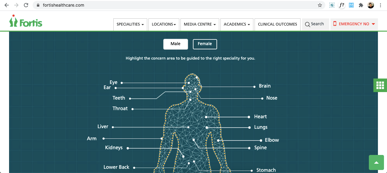
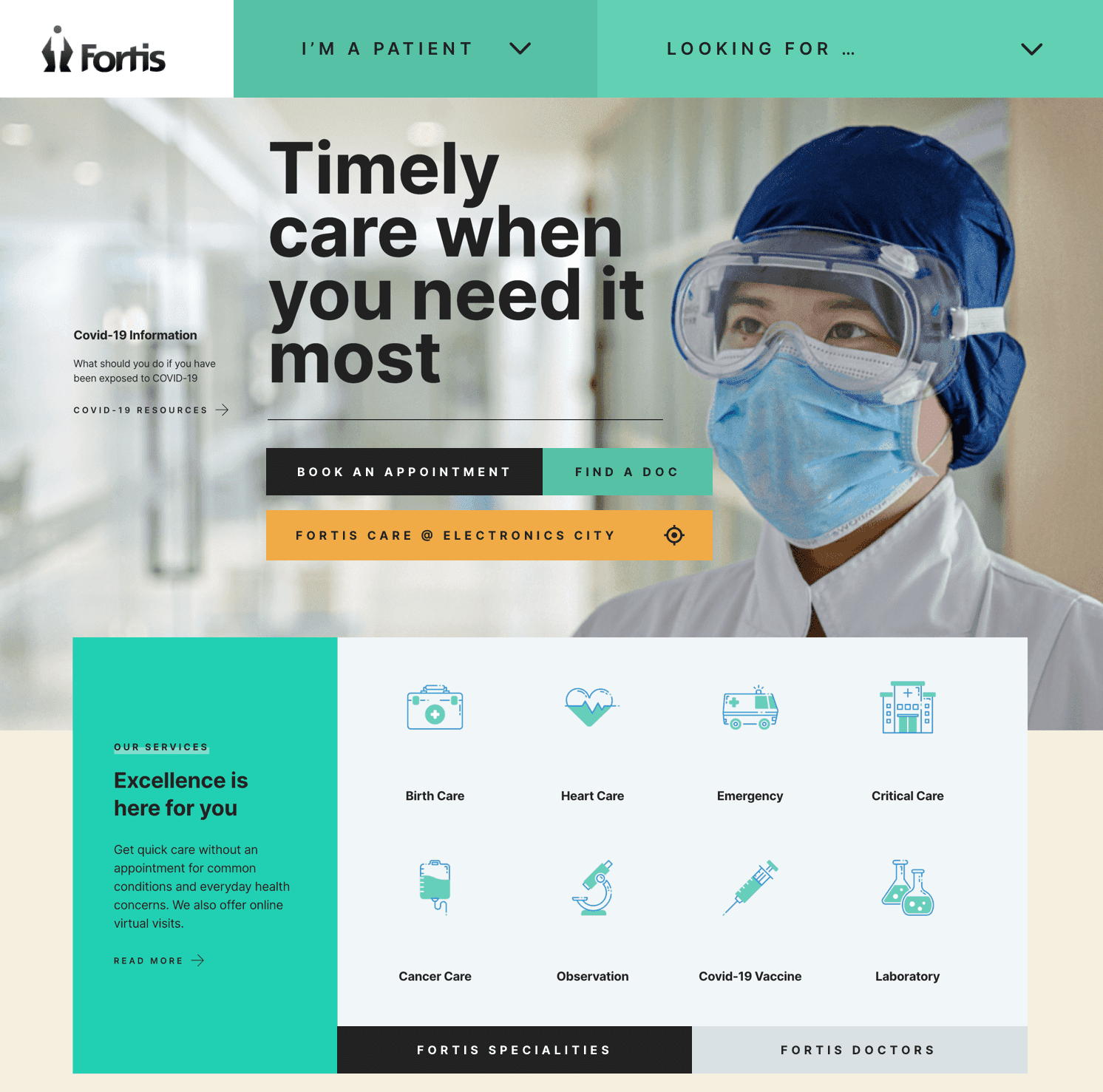
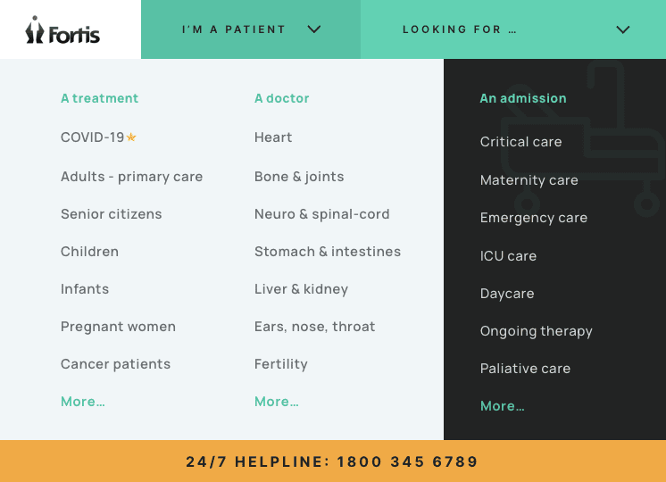
Here’s how the website looked:
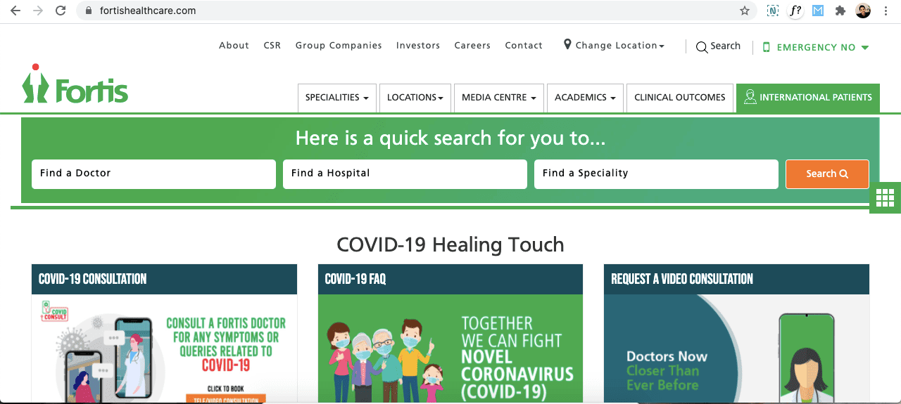
Things that weren’t working well with the current website:
- Site does NOT reflect the state of mind of the patient or patient’s family members supporting them (Persona/Intent based navigation)
- Information overload & CTAs (links) are all over the place & distracting
- Site appears busy, but does NOT show dynamism & location awareness
- Site appears cluttered and preachy – NOT conversational & interactive
- Lack of mobile first / app like dynamism & focused actions – overall
- Agility and dynamism of the Fortis team (offline) is NOT reflected on the site. Hospital reception staff is generally responsive, vigilant and ready to handle unknown situations – the same spirit isn’t reflected in the website. Looks like a passive information site.
- Exploring treatments by organ, may not be relevant for patients who are not yet aware of the problem or need a consultation to know what to diagnose
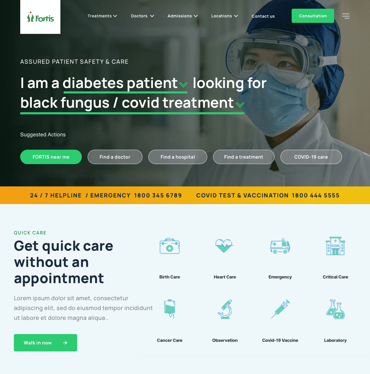
Recommended design approach by Codewave for the revamp exercise:
- Mobile first, minimal, bold, patient-centric interface, biased for action
- Location aware user experience (nearby, now) – hospital/doctor near me
- Patient centric site depicting instancy and urgency of need for care
- Persona based navigation (intent based exploration & interaction)
- Persona based navigation (intent based exploration & interaction)
- Need to understand key needs of patients – at what stage of diagnosis/awareness they’re in and how we can make it simple for everyone to find answers (irrespective of what they know about what they need)
- Discovery of healthcare services by type of need – emergency, admission, ICU, Daycare, OPD etc (not just by departments or organs)
- Conversational UI / CTAs
Related read: 7 design philosophies from our creative team
Variant 1: Modern, App-like feel, Shows urgency & is patient centric
Variant 2 : Classic, Website feel, Informative & persona based
Apart from a UX/UI upgrade, there are many other technical aspects of the website which affects the overall UX – such as:
- Page load time and responsiveness of the website (speed)
- Mobile friendliness and usability on smaller phones
- Security in loading content & in downloading the web pages
- SEO friendliness, discoverability on Google & social search engines
- Integration with dynamic, realtime data – yet loading as fast as a static page
- Multi-lingual support and accessibility features like audio-enablement
- Deeper integrations with smartphone apps like Whatsapp / PayTM for transactions
- Website’s availability 24/7 with minimal downtimes
- Website’s seamless integration with hospital’s CRM systems for realtime data sync
If you found this helpful, you may also like this write-up on GatsbyJS, and its applications to build smart, light weight, high-performance websites businesses can run on 24/7.
Follow Codewave for more such insights and feel free to reach us at [email protected].
Frequently Asked Questions(FAQs)
1. How can the UI/UX of a healthcare app make it more user-friendly for patients?
A healthcare app’s UI/UX can be made more user-friendly for patients by using a simple and intuitive design, providing clear and easy-to-understand information, and making navigation straightforward. It is also important to consider the unique needs and abilities of different patient groups and to conduct user testing to gather feedback and make improvements. Additionally, incorporating features such as personalized dashboards, medication reminders, and secure messaging can improve the overall experience for patients.
2. What are the key design considerations for creating an intuitive and efficient healthcare app?
Designing an intuitive and efficient healthcare app involves several key considerations.
- Good UI/UX/CX.
- On-demand information, doctor scheduling.
- Extensive integration with industry tools.
- Compliance: HIPPA, FD&C.
- Tech architecture scalability.
3. How can a healthcare app’s UI/UX be optimized for use on mobile devices?
A healthcare app’s UI/UX can be optimized for use on mobile devices by implementing several key strategies.
- Responsive Design: The app should be designed with a mobile-first approach, ensuring that all features and functionality are optimized for small screens and touch-based inputs.
- Use in-app analytics: Understanding user journey & flow, and accordingly optimizing the UI/UX.
- Test extensively: Rigorous UI testing and performance testing helps in making the UI/UX personalized.
Codewave is a design thinking led digital transformation company enabling organisations with playful innovation using AI & ML, IoT & Edge, AR, VR, Cloud, Blockchain, and Data.