In Sanskrit, there is a word called नामारूपा meaning “name (nāma) and form (rūpa)”. Everything that we interact within our environment, as we navigate through our world, our reality – be it objects or space, has a name, form & function.
We often gain a perception of brands first through their name & form, before we can get to experience their function.
How do we make that first impression last?
Almost every designer’s aspiration & frustration is to get this right.
We draw inspiration from as many places as possible, speak to people who created the brand, speak to people who’re engaging with the brand, observe how the world perceives the brand, and create that brand persona.
In my view, the following points are extremely critical for great UI design.
- Create a character as if the brand is coming alive for the user, interacting like a real human. The brand persona – with it’s own unique appearance, language & attitude (avatar). If this brand was a person, how would they make an appearance in a social event, connect with people in a fast moving world of expressions?
- Create a design language, unique to how the brand wants to listen, connect, understand, express, communicate, assure & amaze people. This language could be beyond english or words – it could be even a language of color, shapes, symbols & sounds. Remember, Microsoft’s booting up sound?
- Create a moodboard – put together a collection of fonts, colors, shapes, symbols, graphics, sounds, moods, tones, photo filters, text-inputs, voice-inputs, video-inputs, gesture-inputs defining how people can interact with the brand. How does this brand perceive reality? Is it the same 3D world we see as humans? Or is it a 2D vectorized world?
- Centralize styles for consistency. Use UI elements, as building blocks to create a consistent look & feel across all interactions. Repeated use of colors, shapes & symbols lead to higher familiarity & recall. Make sure – the UI sets a distraction-free atmosphere for great conversations.
- Consider standard Web/mobile design systems well established by Apple, Google, Adobe, IBM & others that are popularly used by apps & websites globally. We don’t recommend reinventing the wheel – as people are familiar with existing design systems. Apply your brand’s unique touch and customize it where it matters.
“My aim is to omit everything superfluous so that the essential is shown to the best possible advantage.” — Dieter Rams
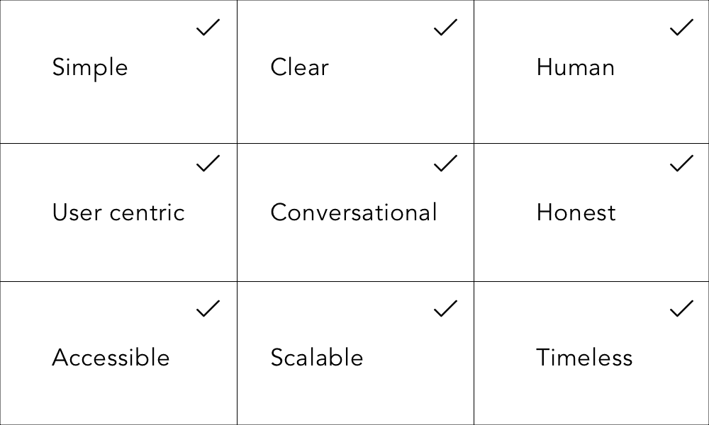
Here are our design principles to help create effective digital interfaces:

Design Principles
What would you add?
We’d love to hear from you.
Designation : Founder, Codewave
Author Bio : Founder @Codewave.com | CII-PwC Top 100 Women Innovators | PMI Future50 | Head – Design Thinking | UX Educator passionate about creating intentional, AI-augmented experiences.


