


According to Statista, the number of smartphone subscriptions worldwide surpasses 6 Billion and is forecasted to grow further by a billion in the next five years.
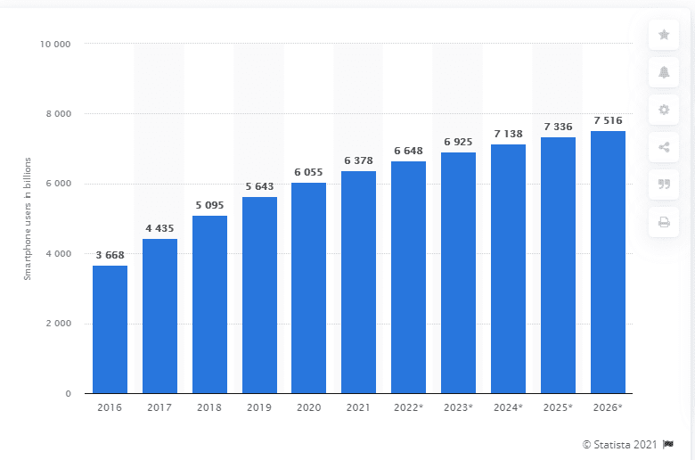
Number of smartphone subscriptions (in millions) worldwide from 2016 to 2026
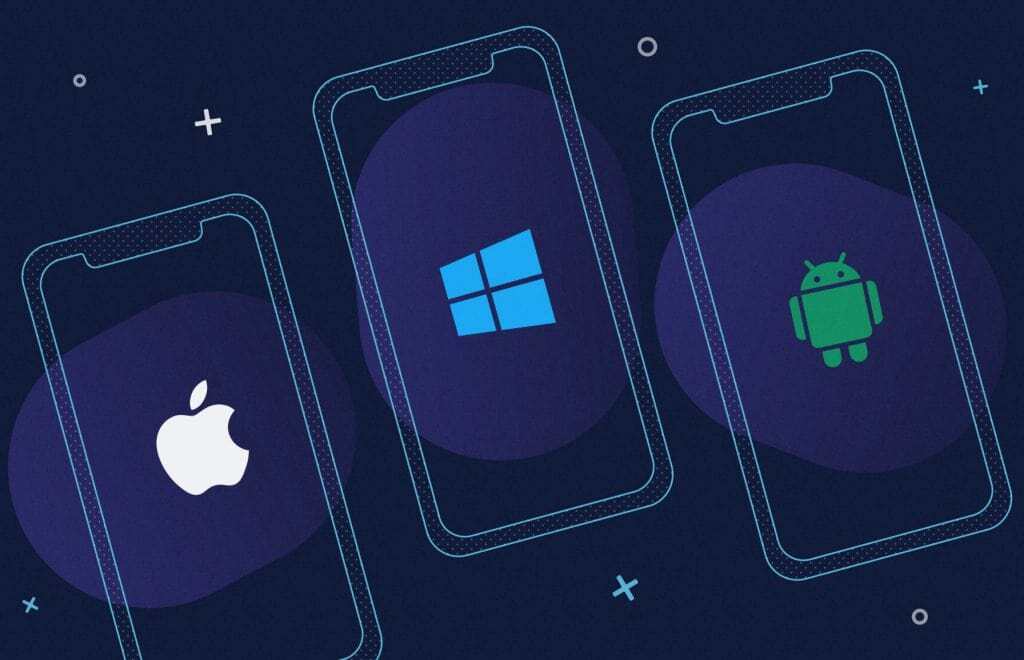
China, India, and the United States are the countries with the highest number of smartphone users. Brands and businesses have forayed into launching mobile apps to tap into the opportunity it presents. And a good share of these businesses uses cross-platform technologies to build their apps.
Why do businesses use cross-platform technologies?

Source: StatCounter Global Stats – OS Market Share
Though mobile platforms are synonymous with android and iOS, there are many mobile OS platforms like blackberry, Symbian, windows phone, web os, and wearable platforms like Wear OS, Fitbit OS, Pebble OS, etc, And now, we also have google home and Alexa skills with a voice interface. And the annual app downloads across these platforms have surpassed 218 Billion in total.
Android maintained its position as the leading mobile operating system worldwide as of Sept 2021, controlling the mobile OS market with a close to 71 percent share. Google’s Android and Apple’s iOS jointly own over 99 percent of the global market share. Samsung, KaiOS, and Nokia OS too have a small but significant presence.
In the early 2000s, there was always this buzz that businesses must have a ‘website’. In the late 2000s, the buzz was- businesses must have a website and a mobile app. But now, with ‘omnichannel presence across platforms’ becoming the mainstream competitive strategy among brands, tech teams are increasingly using cross-platform technologies for faster development and better performance. Because developing the same functionalities in different platform-specific native languages would be so taxing on the finances. Small modifications in the app, and release requirements, etc., would also get tightly constrained. All this would lead to slower innovation and slower business growth.
So, MSMEs usually prefer developing using a single code-base that could be used on different platforms while it saves time, money, effort, and speeds up the development. You can learn more about cross-platform app development technologies on Codewave Insights. Here, we are going to dive deeper into the design aspects of cross-platform development, the DOs, and DONTs.
Why abiding by cross-platform design conventions is critical?
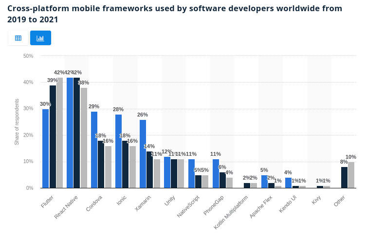
One out of three developers uses cross-platform mobile app development technologies. 80% of these use either Flutter or React Native or both, followed by Cordova, Ionic, and Xamarin. We have detailed insights on each of these technologies. Please do read them & share if you feel it will be helpful for your peers/teams.
While there is no doubt about the potential of Flutter and React Native, the interfaces and functionalities that these technologies could help you build. But often, an app needs to access device/platform-specific features, while maintaining a consistent design experience for users. And this is where it becomes tricky. So, let’s explore the DOs and DONTs of cross-platform app design. After all, a tool is as good as the person using it.
Cross-platform UI design guide for iOS and Android
Balancing platform parity and app similarity
It is crucial for app designers to be acquainted with the core functionalities that are specific to each platform for which they are designing the application. While the design logic follows a universal approach and is the same across the platforms, there are certain functionalities and components that are unique to the native platform. Understanding the core features of the native platform will help in designing interfaces with consistent navigation, toolbar, iconography, and functionality. Therefore, the platform parity and the app similarity are to be balanced for the best outcome.
UI Design guidelines: Platform-specific conventions
Platform-specific design conventions i.e., The Human interface design for iOS, macOS, watchOS, tvOS, and material design for android help the designer to easily adapt designs for both platforms while maintaining the cross-platform design interface & experience consistency. Adapting to platform-specific conventions is important because the major UI differences originate out of these conventions. On a high level, HIG is more about flat, light friendly design, and Material design is more expressive, diverse, reality-based,
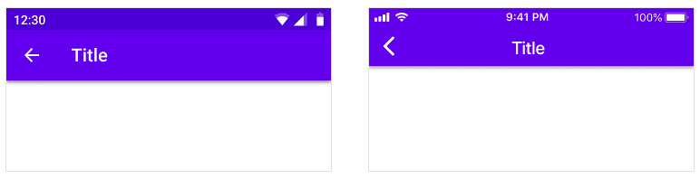
On iOS, toolbars are called navigation bars and their height is shorter than the Android version. On Android, toolbars are called top app bars. It’s recommended to use a platform’s default text alignment for toolbar titles unless multiple action buttons are present. The title is center-aligned for iOS and left-aligned for android. We discuss this in detail in the Navigational section of this article.
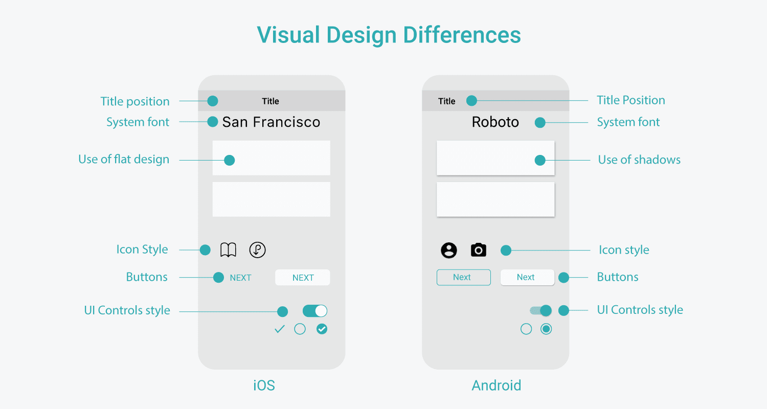
System font for iOS is San Francisco, and for android it’s Roboto. If you’re using Roboto on your android app, fonts on iOS would look different. To maintain consistency, you may upload a custom font to iOS SDK and make use of UIappearance to use this font globally i.e., across the app.
Human interface design does not support shadow use in apps. Whereas, Android apps make use of shadows (z-axis) to bring in the 3D feel. Designers should carefully use shadows in Android apps as the app’s navigation and state change with the changes in Elevation. In iOS, translucency is used to differentiate between content and app bars.
- The primary call to action buttons on iOS are usually towards the top-right corner, with some exception cases whereas for android the call to action buttons are floating type and towards the bottom-right of the page.
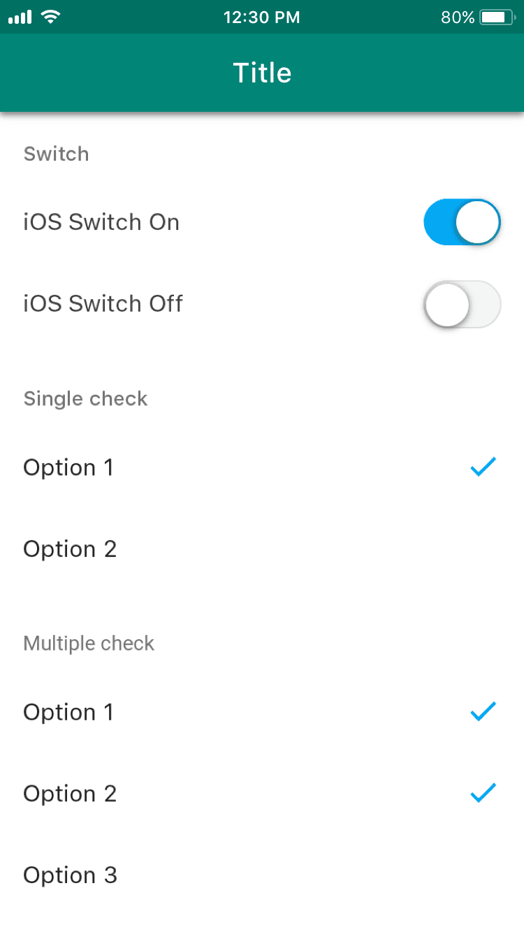
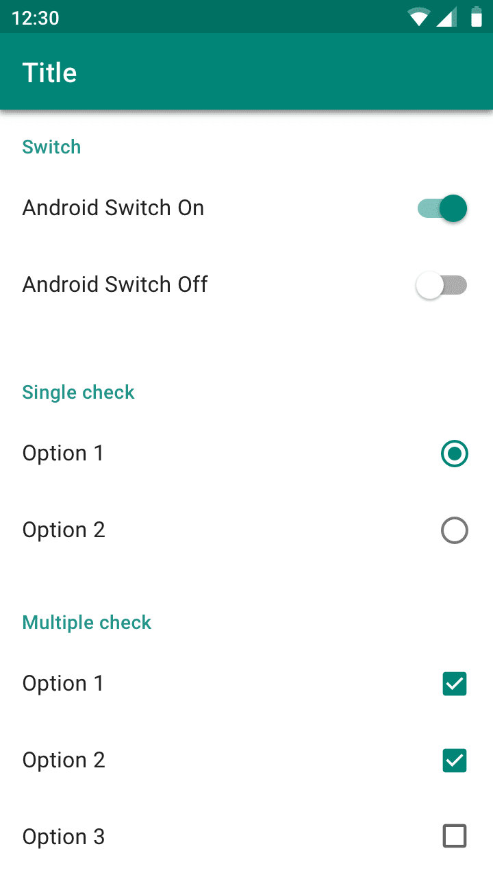
- Android and iOS both have switches. iOS only uses checkmarks for both single and multiple option checkboxes. Android uses radio buttons for single option selections and checkboxes for multiple option selections.
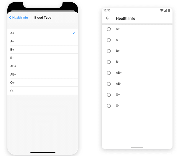
- On iOS, screen space is too small. So, when it comes to choosing multiple/single options from a popup or web application, use picker control to design such functionalities if the choices are only a few (let’s say 2-3). When the options are higher in number, use the entire screen. On Android, the recommendation remains the same for using the screen space. For Android, it’s common to use a dropdown menu or modal dialog for a small number of options.
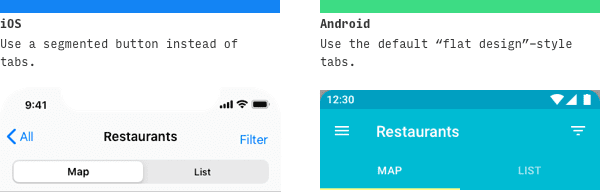
- Unlike Android, iOS does not have tabs, they use buttons for toggling mobile content.
There are three kinds of ways Android communicates to the user or prompts them for input – Snackbars, banners, and dialog. Snackbars auto-disappears, banners are dismissed by clicking on the cross icon but doesn’t intervene with app use if left intact, but dialogs seize app usage until you give the input it needs. iOS does not have these options, In iOS, it’s just Alerts.
On Android, the top screen navigation bar doesn’t necessarily need anything towards the left, by default the title is left aligned. If there is an additional navigation hamburger button, then it appears on the left of ‘Title’.

Also, for Android, there is a universal navigation bar at the bottom for reverse page action. If you don’t intend to use it then you may include a back arrow with a middle line to the top navigation.
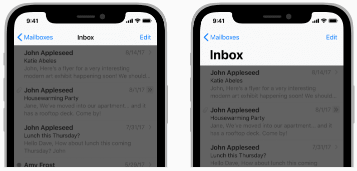
There is no universal navigation bar in iOS, instead, every app screen has a button on the top left corner. Note that the back arrow in the top navigation bar for iOS doesn’t have a middle line.

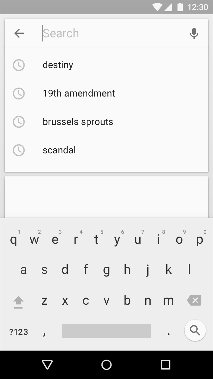
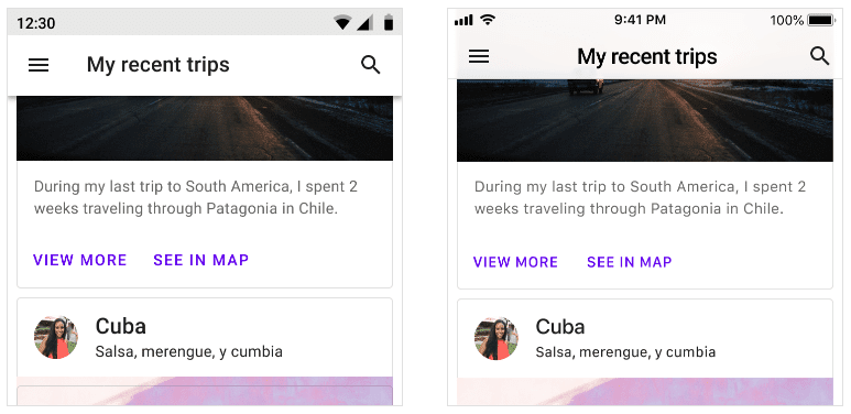
Search components are almost the same on android as well as on iOS. If ‘search’ is a core functionality of the app then most probably it would be available as an option in the primary tabs on iOS or a search action icon would be present in the top navbar.
The difference in UI for the search component is about how you cancel it. The back arrow in android is used to abort a search, while a cross icon needs to be clicked to cancel the search in iOS.
List of UI components that are unique to iOS:
- Page control, natively it’s absent from Android
- Screen specific action toolbars at the bottom of the screen
- Steppers
- Popovers
List of UI components that are unique to Android:
- Bottom & side sheet
- Bottom navigation drawer
- Backdrops
- Snackbars
- Banners
- Navigation drawers
Common UI/UX design mistakes
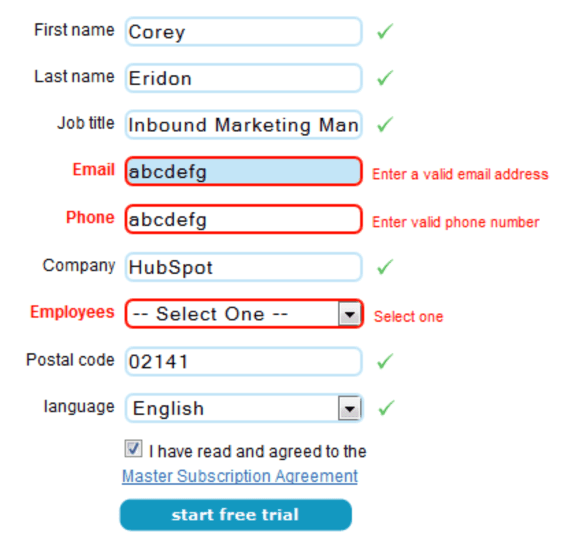
Inconsistent UI elements:
Being too generous with the fonts size, colors, navigation, can overwhelm the user leading to confusion. Consistency in the template, color scheme, and fonts among pages is the key factor for a smooth and seamless user experience. Low contrast text and elements decrease readability. In the below example, the text in the search boxes and navigation are too light and small to be read.

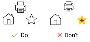
Bad iconography
Inconsistent icons that are different in size, scheme, or color are not aesthetically pleasing. It is also important to concentrate on the basic characteristics and not add too many graphic details onto the icon. Icons have to adhere to the platform conventions.
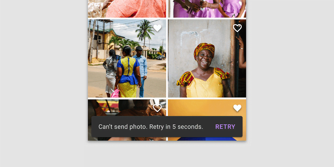
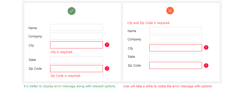
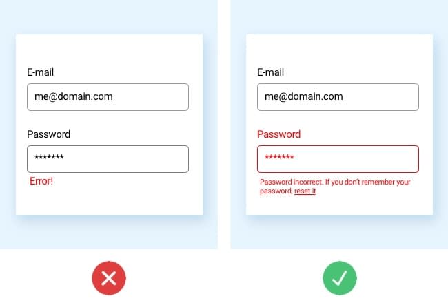
Ambiguous error messages
The error messages should not leave the user wondering about what went wrong and where.
Steep learning curve
The complex layouts, not-so-easy navigation are not the signs of an intuitive app. If the user is unable to understand the app easily, the app is most likely to be abandoned.
Overloaded pages
These create a negative user experience. Too much information on a single page will definitely overwhelm the user. The WeatherBug app is a classic example of overloading information. The user wouldn’t want to stay in the app where the important information is lost in the clutter.

Lengthy sign-in procedure/registration process
Once the app is installed, the user wouldn’t want to spend a lot of time entering information to sign up. Too many criteria for setting up the password is also a bad UX example
Not considering the user feedback
Overconfidence is definitely not going to work here. What the designer thinks might not be what the user perceives. Consistent feedback from the user and relevant modifications will result in a happy user. The app should be built such that it is adaptable and can be updated. All successful apps have been reinvented over the years.
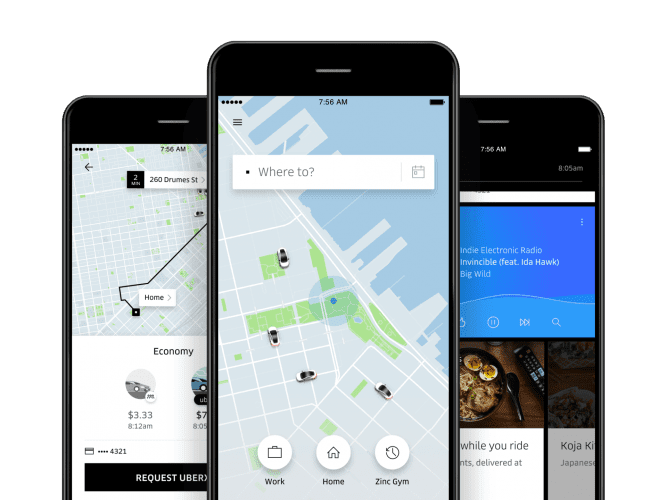
Uber overhauled the app to make it more intuitive. The Uber app we see today wasn’t the same a few years ago. Based on the feedback, the app was made more intuitive by emphasizing ‘Where to’ and categorizing the travel options as ‘economy’ and ‘premium’.
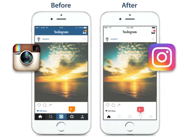
Instagram valued the user feedback and adapted for the better. Instagram changed the logo, colors, and contrast for bettering the user experience which has obviously worked.
Summing it up!
Having discussed all the above intricacies of cross-platform app design, it is recommended to follow native guidelines while developing a cross-platform app, but it is not a hard and fast rule, there can be exceptions based on your preference. After all, design is about context, about who is using it, about the use-case. For example, material design (characteristic to Android ) is followed in iOS for Gmail. while Instagram is inclined towards Human interaction model design for both Android and iOS.
As mentioned earlier, the cross-platform apps developed using Flutter or React Native is at par with the native app performance. You can access the native hardware APIs for the Camera, accelerometer, and other components using these modern, open-source, cross-platform app development technologies, and thus build an amazing UI.
We at Codewave Technologies have a good bunch of experienced developers & designers. Vidhya, co-founder and design head at Codewave, is a PMP future 50 leader and specializes in design thinking. They have built 50+ apps using native technologies i.e., SWIFT for iOS and Java/Kotlin for Android. Using Flutter and ReactNative, they have built around 210+ apps. In short, they have a total accumulative experience of 300+ web and mobile apps using native & cross-platform development technologies, across 13+ industries and 10+ geographies around the globe.
Codewave is a design thinking led digital transformation company enabling organisations with playful innovation using AI & ML, IoT & Edge, AR, VR, Cloud, Blockchain, and Data.